


TL;DR:
- Choosing art begins with defining the room’s desired mood and measuring wall space to ensure proper fit.
- Selecting art based on shared colors, material, and quality ensures long-term harmony and visual coherence.
Pick art that moves you emotionally, fits the wall’s proportions, carries at least one color already in the room, and arrives in a material that suits your space and budget. That five-part checklist covers the core of every smart art purchase. Design and gallery professionals agree: mood comes first, measurements come second, and everything else follows from there.
“Selecting art is deeply personal — start by naming the mood you want the room to communicate and let that guide your search.” — Liz Lidgett, interior design expert, via The Spruce
Quick checklist:
- Define the room’s intended mood (soothing, energetic, sophisticated) before you browse.
- Measure the wall and the furniture beneath it; write the numbers down.
- Identify two to three dominant room colors and look for art that contains at least one.
- Choose a material and finish that match both the room’s humidity and your budget.
- Confirm provenance, production time, and any hidden costs (framing, shipping, tax) before checkout.
- Try Artify’s 3D room preview to see the piece in your actual space before you commit.
Table of Contents
- What are the best art piece selection tips to follow?
- How do you size and place art so it actually looks right?
- How do you match color and style without making it look too “matchy”?
- Which materials and print types should you choose?
- Where should you buy art, and what should you expect to pay?
- How can you preview art in your space before buying?
- How do you choose art as a gift or for a special occasion?
- What’s the single most important thing to do before you buy?
- Key Takeaways
- Why emotion beats trendiness every time
- Artify makes the selection process concrete
- FAQ
- Useful sources
What are the best art piece selection tips to follow?
Start with mood, not aesthetics. Pros recommend deciding whether a room should feel soothing, dramatic, or sophisticated before you open a single gallery tab. That single decision narrows a universe of options down to a manageable short list.
- Define purpose and mood. Ask what the room needs to feel like after the art goes up. A bedroom calls for calm; a home office might want something energizing.
- Measure before you shop. Note the wall width, the furniture width beneath it, and the ceiling height. Bring those numbers with you, literally or in your phone.
- Run the thread-of-connection color check. Design pros recommend identifying two to three dominant room colors and finding art that contains at least one. You are not matching; you are connecting.
- Pick medium and finish. Canvas reads warm and tactile; metal prints are sharp and modern; giclée on paper suits a gallery-style room. More on each below.
- Set a real budget. Hidden costs — framing, cross-state shipping, sales tax, and auction fees — can add meaningfully to the listed price. Get framing quotes before you finalize.
- Check provenance and timeline. For originals and limited editions, ask for a certificate of authenticity. For gifts or events, confirm the production and shipping window before ordering.
Pro Tip: Walk away from any piece you feel pressured to buy on the spot. A mandatory cooldown period — even 24 hours — filters out impulse buys and confirms genuine long-term resonance.
How do you size and place art so it actually looks right?
The concise rule: artwork above a sofa should span two-thirds to three-quarters of the sofa’s width, and the center of any primary piece should hang at roughly 57–60 inches from the floor. That eye-level standard works across almost every room.

| Location | Width guideline | Hanging height (center) | Notes |
|---|---|---|---|
| Above sofa | roughly two-thirds to three-quarters of sofa width | eye level from floor | Leave a moderate gap above sofa back |
| Above mantel | Equal to or slightly narrower than mantel | 57–60 in. from floor | One strong piece anchors the room |
| Hallway | Proportional to wall width | Eye level (approx. 57 in.) | Series of smaller pieces works well |
| Large blank wall | Statement piece or gallery wall | 57–60 in. center | A medium-sized piece is a solid baseline |
For a gallery wall, keep spacing consistent at 2–3 inches between frames. Tape paper templates to the wall first and step back to check the composition before you drive a single nail. Oversized pieces can anchor a large wall beautifully on their own; a single modest print on an expansive wall tends to look lost. When in doubt, go bigger.
Pro Tip: Use professional art hooks rather than standard nails. They distribute weight more evenly and reduce the risk of damage if a piece is heavier than expected.
How do you match color and style without making it look too “matchy”?
Use the thread-of-connection approach: find art that shares at least one of the two to three dominant colors already in the room. You are not trying to replicate the palette; you are creating a visual conversation between the art and the space.
Contrast can be just as effective as harmony. A bold abstract in a neutral room creates energy without chaos, as long as one color in the piece echoes something already present — a throw pillow, a rug, the wood tone of a shelf. The art stays lively; the room stays coherent.
Curious detachment is the technique that separates collectors from decorators. It means deliberately sampling art outside your usual preferences to find pieces that hold up over time rather than just reflecting a current trend. Try a style you would normally scroll past. If it still interests you after a week, that is a signal worth acting on.
Pro Tip: Test a contrasting piece in a neutral corner of your home for a few days before committing. If it still holds your attention on day three, it belongs.
Which materials and print types should you choose?
For durability in high-traffic or humid spaces, metal or acrylic prints are the practical choice. Museum-grade giclée prints provide high-quality reproduction. Limited-edition prints offer accessible quality for new collectors.
Material quick-scan:
- Canvas: Warm, textured feel; suits traditional and contemporary rooms equally; prone to humidity warping without proper stretching.
- Giclée print: Archival inks on fine-art paper or canvas; museum-grade longevity; the go-to for collectors who want print quality close to an original.
- Photographic print: Sharp detail and color accuracy; best for photography-based work; less tactile than canvas.
- Metal print: High contrast, vivid color, moisture-resistant; ideal for modern or industrial spaces and bathrooms.
Framing is the final edit. Mismatched frames in a salon-style arrangement can feel layered and full of character; a consistent frame style across a series brings calm. Archival framing (UV-protective glass, acid-free mat) matters most for works on paper and giclée prints, where light and acid degrade color over time.
“Galleries and experts emphasize securing documentation — certificates of authenticity, receipts, condition reports — for insurance and resale value.” — Agora Gallery
For custom sizing options and their effect on composition, the dimensions you choose affect how a piece reads on the wall as much as the image itself does.
Where should you buy art, and what should you expect to pay?
Buy pre-made for short timelines; commission or custom-print when you have weeks to months available. The table below maps typical tiers.
| Type | Typical price range | Lead time | Best for |
|---|---|---|---|
| Prints / limited editions | wide price range | quick turnaround | First buyers, gifts |
| Framed custom prints | moderate price range | moderate lead time | Personalized gifts, home decor |
| Small originals / studies | starting at affordable prices | variable lead time | Entry-level collecting |
| Commissioned originals | higher price range | longer lead time | Milestone gifts, statement pieces |
For gifts, personalization is the differentiator. A custom print from a meaningful photograph, delivered in archival framing with a note about the piece’s provenance, lands differently than a generic print. Allow at least two weeks for framed custom work; commissioned originals need four to twelve weeks minimum. Provenance documentation — receipts, certificates, condition reports — is worth requesting even for prints, since it supports insurance claims and future resale.
How can you preview art in your space before buying?
Use mockups or 3D room previews before buying to confirm scale and color balance. The fastest low-tech method: cut paper to the exact dimensions of the piece you are considering and tape it to the wall. Step back. Live with it for a day.
For a more accurate read, take a photo of your wall and use a scaled overlay in any basic photo-editing app. Artify’s 3D room preview goes further, placing the actual artwork into a rendered version of your space so you can check how framing, color, and scale interact before you order.
Pro Tip: Check the piece at different times of day. Morning light and evening lamp light can shift how a color reads dramatically. A piece that looks perfect at noon may feel cold under warm evening lighting.
How do you choose art as a gift or for a special occasion?
Choose pieces that reflect the recipient’s taste and the occasion. Personalized photographs or limited-edition prints are safe, meaningful options when you are uncertain about someone’s style.
Gift checklist:
- Know the recipient’s existing color palette and furniture style before you shop.
- Pick a scale appropriate for their space (a large framed piece is a commitment; a smaller print is easier to place).
- Choose a durable finish — metal or framed giclée — so the piece survives moves and time.
- Allow lead time: at least two weeks for framed custom prints, four or more for commissioned originals.
- Include a note about the piece’s provenance or the artist’s background; it adds meaning and serves as informal documentation.
For milestone occasions (weddings, anniversaries, retirements), commission a custom piece. For last-minute gifts, a pre-made print from a curated collection ships quickly and still feels considered.
What’s the single most important thing to do before you buy?
Confirm emotional resonance before you confirm anything else. Scale, color, and material are all fixable in post; buying a piece that leaves you cold is not.
Run the checklist: mood first, measurements second, color thread third, material and budget fourth, provenance and timeline fifth. Visualize it in the space before you commit. If it still holds your attention after a cooldown period, buy it.
“The art that truly belongs in a space will settle so naturally that you stop noticing it — and only feel its absence if it is removed.” — Kit Kemp Design Studio
Artify’s 3D room preview and framing tools make that visualization step concrete rather than guesswork. For deeper guidance on choosing art room by room, the process scales from a single accent wall to a whole-home collection.
Key Takeaways
Emotion-first selection, confirmed by scale and a color thread, produces art choices that hold up for years rather than seasons.
| Point | Details |
|---|---|
| Mood before aesthetics | Define the room’s intended feeling before browsing; it narrows options faster than any filter. |
| Size and sight lines | Hang primary art at 57–60 in. center height; above a sofa, span two-thirds to three-quarters of its width. |
| Thread-of-connection color | Find art containing at least one of two to three dominant room colors for cohesion without over-matching. |
| Keep your paperwork | File receipts, certificates of authenticity, and condition reports — they matter for insurance and resale. |
| Artify for custom and pre-made | Artify offers 3D room previews, framing options, and museum-grade giclée prints for both quick purchases and custom commissions. |
Why emotion beats trendiness every time
The conventional advice is “buy what you love,” but that framing skips the harder question: how do you know what you actually love versus what you love right now? Trend-driven purchases tend to date quickly. A piece that felt fresh because it matched a popular palette in a given year can feel tired within two or three seasons.
The more durable approach is what ArtRow calls curious detachment: deliberately exposing yourself to work outside your immediate preferences and noting what still resonates after the novelty fades. Liz Lidgett’s emotion-first framing points to the same principle from a different angle. When you start with the mood a room needs to communicate, you are selecting for long-term fit rather than short-term appeal.
The practical test is simple: prop the piece against the wall and leave it there for a few days. If you stop noticing it in a neutral way and only feel its absence when it is moved, it belongs. If you keep second-guessing it, keep looking.
Artify makes the selection process concrete
Choosing art is easier when you can see it in your actual space before you pay. Artify’s 3D room preview places your chosen piece, frame and all, into a rendered version of your room so scale, color, and finish are visible before checkout. That single feature removes the biggest source of buyer’s remorse in art buying.
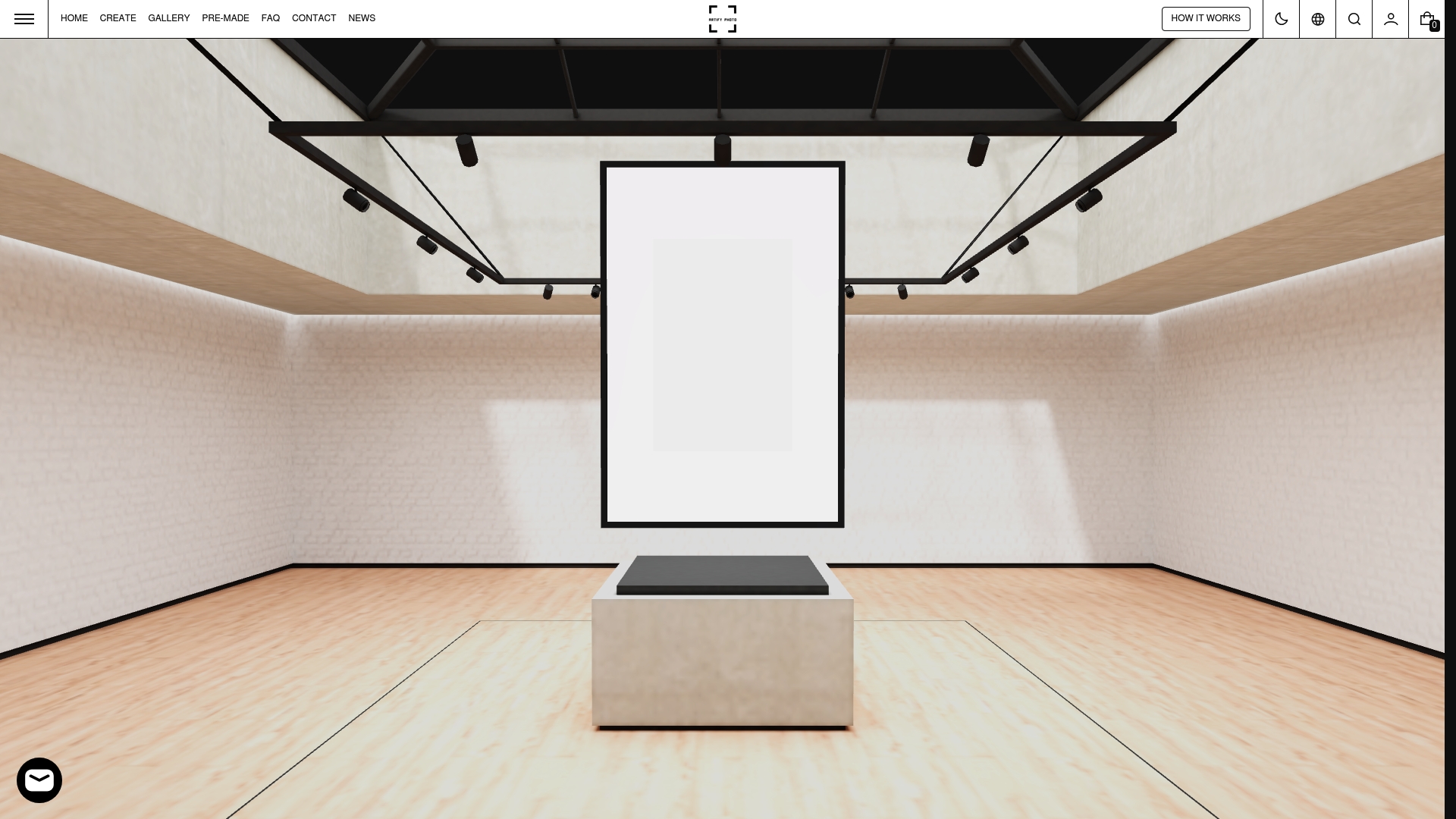
Beyond visualization, Artify covers the full checklist: pre-made collections for buyers who need something quickly, custom photo-to-art creation for milestone gifts and personalized pieces, museum-grade giclée printing, and framing options from gallery-style to archival. Production on most orders runs within days, not weeks, and every piece ships with documentation you can file for provenance. Start with the 3D preview or browse the pre-made collections to find a piece that fits your space and your timeline.
FAQ
What is the first step in choosing art for a room?
Define the mood you want the room to convey before you browse. Design professionals consistently recommend starting with emotional intent — soothing, energizing, or sophisticated — rather than color or style.
How big should art be above a sofa?
Artwork above a sofa should span roughly two-thirds to three-quarters of the sofa’s width, with the center of the piece hanging at approximately 57–60 inches from the floor.
What is the thread-of-connection color rule?
Identify two to three dominant colors already in the room and look for art that contains at least one of them. The goal is visual connection, not exact matching.
How do I choose art as a gift without knowing someone’s taste?
Personalized photographs or limited-edition prints in neutral or classic framing are safe choices. Allow at least two weeks for framed custom work, and include provenance documentation with the piece.
Does Artify offer a way to preview art before buying?
Yes. Artify’s 3D room preview places the selected piece, with framing, into a rendered version of your space so you can confirm scale and color balance before you order.
Useful sources
- The Spruce: 5 Steps Pros Never Skip When Buying Artwork — supports mood-first selection, hidden costs, and the cooldown tactic.
- Molly Frantzen: How to Choose Art for Your Home — primary source for the thread-of-connection color rule and sizing guidelines.
- Agora Gallery: Buying Art — A Contemporary Collector’s Guide — covers provenance, documentation, and medium comparisons.
- ArtRow: 5 Tips for Buying Art — source for curious detachment and resisting trend-driven purchases.
- Artsy: What You Need to Know About Buying Your First Artwork — supports the cooldown period recommendation.
- Kit Kemp Design Studio: How to Choose Art for a Room — framing as the final edit, scale confidence, and the live-with-it test.
When buying on the secondary market, always request and file the seller’s condition report and certificate of authenticity. These documents are your primary evidence for insurance claims and future appraisal.