

TL;DR:
- Choosing the right framed art involves considering scale, frame style, and archival materials to create a cohesive and balanced display. Proper sizing, placement at 57 inches eye-level, and selecting frames that support the artwork’s palette are essential for a polished look. Patience and thoughtful planning, including living with the piece beforehand, ensure a timeless and visually appealing result.
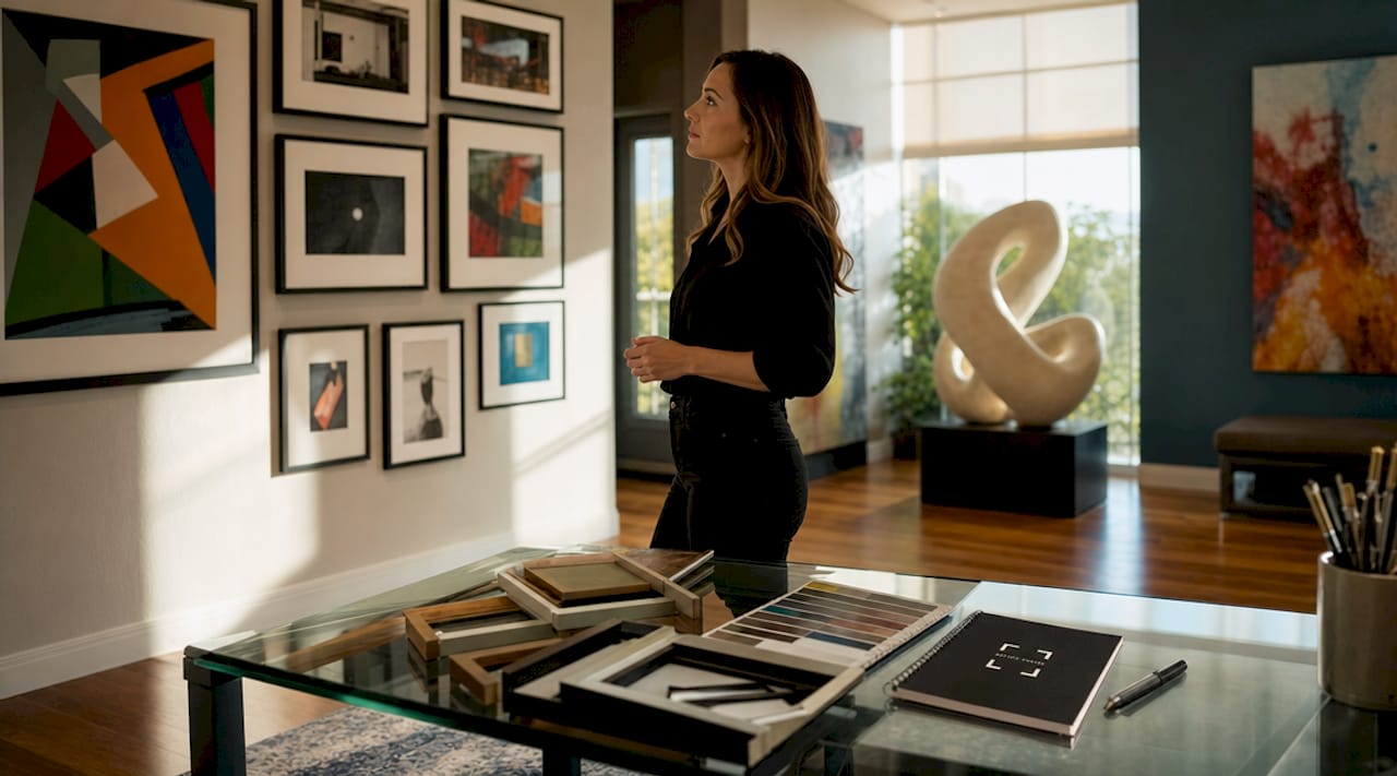
The framed art selection process is the methodical approach to choosing artwork and framing materials that complement both the piece itself and your living space. Done well, it transforms a bare wall into a focal point. Done poorly, even beautiful art can look awkward, out of scale, or visually disconnected from the room around it. This guide covers every critical decision: size and scale, frame style and materials, matting and glazing, and placement. Whether you are working with a print from Artify or a one-of-a-kind original, the same principles apply.
How does the framed art selection process work?
The framed art selection process begins before you ever pick up a hammer. It starts with understanding what the artwork needs to succeed in a specific space, and that means thinking about scale, light, and the visual relationship between the art and everything else in the room. ArtStar, one of the most referenced sources in professional framing, describes the primary goal of a frame as supporting the artwork and complementing the room without overshadowing either. That single principle should guide every decision you make.
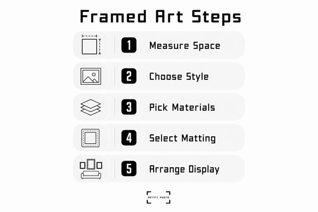
The process covers six core decisions: size relative to the room and furniture, frame style and material, mat width and color, glazing type, hanging height, and grouping arrangement. Skipping any one of these steps is where most buyers go wrong. A frame that is too ornate for a minimalist print, or a mat color that clashes with the artwork’s palette, can undermine the entire composition. Treating each decision as part of a connected system is what separates a polished result from a frustrating one.
What size framed art works best for your space?
Scale is the single most common mistake in the framed art buying process. Choosing art too small for a large wall is widely cited as the worst error a buyer can make. A small piece on a large wall looks lost and unintentional, while a confident scale or a well-planned grouping creates a premium, cohesive look that anchors the room.
The most reliable sizing rule comes from interior designers: artwork width should be about two-thirds of the width of the furniture beneath it. For a 72-inch sofa, that means targeting art or a grouping that spans roughly 48 inches. This ratio creates visual balance without the art competing with the furniture for dominance.
| Furniture width | Recommended art width | Notes |
|---|---|---|
| 36 inches (accent chair) | 22 to 24 inches | Single piece works well |
| 60 inches (loveseat) | 38 to 42 inches | Single large piece or tight pair |
| 72 inches (sofa) | 46 to 50 inches | Single statement piece or curated grouping |
| 84 inches (king headboard) | 54 to 58 inches | Diptych or triptych format recommended |
| Full wall (no furniture) | 60 to 70% of wall width | Leave breathing room on both sides |
Room function also matters. A bedroom calls for softer, more intimate scale. A dining room or entryway can handle bolder, larger pieces because viewers experience those spaces briefly and from a distance. Check Artify’s size guide for specific dimension recommendations matched to common room types.
Pro Tip: Prop the artwork against the wall for two to three days before committing to a frame or hanging position. Living with the piece in natural and artificial light reveals how it reads at different times of day and whether the scale feels right in practice.
How do you choose the right frame style and material?
Frame selection is where most buyers overthink the room and underthink the artwork. The frame should respond to the art first, and to the room second. Neutral and subtle frames consistently outperform bright or heavily decorative options because they support the art’s palette rather than competing with it. A bold gold frame on a delicate watercolor, for example, draws the eye to the frame rather than the image.
The most popular frame materials each serve a distinct purpose. Natural wood works with organic, botanical, and landscape prints. Black metal or matte black wood suits photography, graphic prints, and contemporary abstract work. White or off-white frames complement Scandinavian interiors and light-palette artwork. Ornate gilded frames belong with classical oil paintings or formal portraiture, not with modern prints. Frame molding width and depth should also scale with the artwork: smaller prints need narrower, shallower profiles, while large-format pieces benefit from wider, deeper moldings that give the composition visual weight.
| Frame style | Best for | Avoid with |
|---|---|---|
| Matte black metal | Photography, graphic art, modern prints | Traditional oil paintings, warm-toned botanicals |
| Natural wood (light) | Botanicals, landscapes, Scandinavian decor | Dark, moody, or high-contrast artwork |
| White or off-white | Watercolors, light-palette prints, gallery walls | Heavily ornate or classical subjects |
| Gilded or ornate gold | Classical paintings, formal portraiture | Minimalist, contemporary, or photographic work |
| Floating mount | Canvas prints, textured originals | Works on paper that need mat protection |
Color selection within a frame finish is equally important. Pull one secondary color from the artwork, not the dominant color, and use it to guide your frame choice. If a print contains warm amber tones, a warm walnut frame reinforces that without overwhelming it. Avoid frames that match the wall color exactly, since that causes the artwork to visually disappear.
Pro Tip: When in doubt, choose a frame that is one shade darker than the lightest tone in the artwork. This creates subtle contrast that makes the piece read clearly without the frame demanding attention.
What matting and glazing options protect and present artwork best?
Archival framing is the professional standard for any artwork you intend to keep long-term. Acid-free mats, UV-protective glazing, and conservation-grade materials protect artwork from fading, moisture, and airborne pollutants. For prints and works on paper, skipping archival materials means the piece can yellow, fade, or deteriorate within a few years, regardless of how good the frame looks.
Mat width shapes how the artwork breathes within the frame. A narrow mat of one inch or less can make a piece feel cramped. A standard mat of two to three inches works for most prints. A wide mat of four inches or more creates a gallery-quality presentation that gives the artwork visual space and makes even modest prints look significant. Mat color should almost always be white, off-white, or a very light neutral. Colored mats can work when pulled directly from a secondary tone in the artwork, but they require a precise match or the result looks accidental.
Here are the key glazing decisions to understand before you buy:
- Standard glass is affordable and clear but offers no UV protection and can shatter.
- UV-filtering glass blocks up to 99% of ultraviolet light and is the minimum recommended for any print or original you want to preserve.
- Acrylic (Plexiglas) is lighter than glass, shatter-resistant, and ideal for large-format pieces or homes with children. It does attract dust and can scratch more easily.
- Anti-reflective glass or acrylic eliminates glare almost entirely and is worth the added cost for pieces hung in rooms with strong natural or artificial light.
- Canvas prints typically do not require glazing since the medium is not light-sensitive in the same way paper is.
Pro Tip: Make the bottom mat border slightly wider than the top and sides. The human eye perceives a centered image as sitting lower than it actually is, and a wider bottom border corrects that illusion so the artwork appears perfectly centered.
What are the best practices for hanging and arranging framed art?
Placement is where the framed art selection guide meets execution. The professional standard places the center of the artwork at 57 inches from the floor, which aligns with average human eye level. Galleries use this height universally because it works across nearly every room height and viewer height combination. Hanging art too high is the most common placement error in residential spaces.
Follow these steps for a clean, professional result:
- Measure 57 inches from the floor and mark the wall lightly with a pencil. This is your center point.
- Calculate the distance from the top of the frame to the hanging hardware on the back of the piece. Subtract half that distance from 57 inches to find where your nail or hook goes.
- Arrange frames on the floor in front of the wall before drilling. This lets you test spacing and proportions without damaging the wall.
- For groupings, maintain 2 to 3 inches of space between frames. More than 4 inches makes the grouping read as separate pieces rather than a cohesive collection.
- When hanging art above furniture, leave 6 to 8 inches of clearance between the top of the furniture and the bottom of the frame.
- Use a level on every piece. Even a one-degree tilt is visible and distracting once you step back.
Pro Tip: For gallery walls with mixed frame sizes, cut paper templates of each frame and tape them to the wall with painter’s tape. Rearrange the templates until the layout feels right before you touch a drill.
Key takeaways
The framed art selection process succeeds when scale, frame style, archival materials, and precise placement work together as a single system rather than separate decisions.
| Point | Details |
|---|---|
| Scale before style | Target artwork width at roughly two-thirds of the furniture beneath it to avoid the most common sizing mistake. |
| Frame follows art | Choose frame style and color to support the artwork’s palette, not to match the room’s furniture. |
| Archival materials matter | Use acid-free mats and UV-protective glazing to protect any print or original you plan to keep long-term. |
| 57-inch hanging rule | Center every piece at 57 inches from the floor to match professional gallery standards and average eye level. |
| Test before committing | Prop art against the wall for several days and arrange frames on the floor before drilling to avoid costly mistakes. |
Why the “buy it and figure it out later” approach always costs more
At Artify, we have seen the same pattern repeat itself: someone buys a beautiful print, grabs a cheap frame from a big-box store, hangs it too high on the wrong wall, and then wonders why the room still does not feel right. The art was never the problem. The process was.
The part most buyers skip is patience. Living with a piece before framing it, testing frame samples against the actual artwork in the actual room, and planning the wall layout before picking up a drill. These steps feel slow, but they are what separate a room that looks curated from one that looks assembled.
One thing we have learned from working with independent artists and home decorators is that timeless frame choices age far better than trendy ones. A matte black or natural wood frame purchased today will still look right in ten years. A frame chosen to match a specific furniture trend probably will not. The same logic applies to mat colors: white and off-white never go out of style, and they never fight with the artwork.
For original or high-value pieces, professional framing is worth the cost. For prints and reproductions, quality DIY framing with archival materials can reduce costs by 40 to 60% without sacrificing the result. The key is knowing which category your piece falls into before you start.
— Artify
Ready to find art that fits your space perfectly?
Choosing framed art is easier when the hard decisions are already made for you. Artify’s pre-made collections feature gallery-quality prints curated by independent artists, available in a range of sizes and ready to frame or order framed and ready to hang. Every piece is printed on demand, which means you get a fresh, high-quality result rather than warehouse stock.
If you want to explore your options before committing, Artify’s sizes and framing guide walks you through every available format, material, and framing configuration. You can also browse the full artwork gallery to see how different styles look in real room settings. For anyone upgrading their home decor alongside their art choices, Kitchen Devotion’s kitchen furniture upgrades guide covers how to coordinate art and furniture selections across connected living spaces.
FAQ
What is the standard height for hanging framed art?
The professional standard places the center of the artwork at 57 inches from the floor, which aligns with average human eye level. This height is used universally in galleries and works across nearly every room configuration.
How do I know if my art is the right size for my wall?
Artwork above furniture should span roughly two-thirds of the furniture’s width. For open walls, aim for art or a grouping that covers 60 to 70 percent of the wall width, leaving visual breathing room on both sides.
What is archival framing and do I need it?
Archival framing uses acid-free mats, UV-protective glazing, and conservation-grade materials to protect artwork from fading, moisture, and pollutants. It is recommended for any print or original you intend to keep long-term.
Should I match my frame to my furniture or my artwork?
Match the frame to the artwork first. Frames that respond to the art’s palette and subject matter produce better results than frames chosen to coordinate with furniture, which can make the art feel like an afterthought.
Is DIY framing a good option for prints?
DIY framing with quality archival materials can reduce costs by 40 to 60 percent compared to professional framing and produces excellent results for prints and reproductions. Professional framing is the better choice for original artwork, high-value pieces, or unusual formats.