


TL;DR:
- Art influences room ambience by using color, scale, texture, lighting, and subject matter to evoke specific emotional and sensory responses. Research shows that nature-themed art can significantly reduce depression and anxiety over time, especially when placed strategically. Previewing art in your space before purchase ensures it enhances the desired mood and harmony.
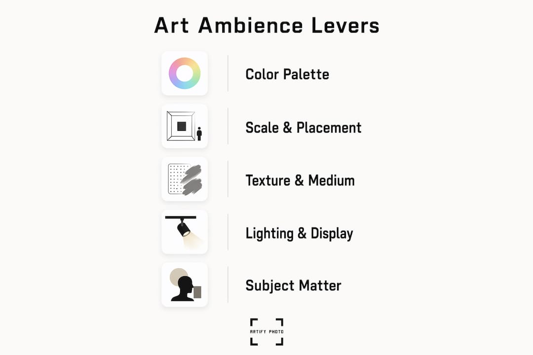
Visual art shapes a room’s ambience by activating emotional, attentional, and sensory responses through five specific levers: color, scale and placement, texture and medium, lighting and display, and subject matter. Each one operates differently, and together they determine whether a space feels calm, energized, intimate, or expansive. The effects are not subtle — empirical research shows that sustained exposure to biophilic art installations produced clinically meaningful reductions in both depression and anxiety over 12 months.
Here is what each lever does at a glance:
- Color: Warm palettes (reds, oranges, deep yellows) raise emotional activation and perceived coziness; cool palettes (blues, greens, soft grays) lower arousal and signal calm.
- Scale and placement: Oversized works create drama and make ceilings feel taller; small or clustered pieces pull the eye inward and create intimacy.
- Texture and medium: Impasto paint and textile works read as warm and tactile; glossy prints and metal surfaces read as crisp and contemporary.
- Lighting and display: Warm-toned spotlights deepen a cozy mood; cool, even lighting sharpens a modern or focused atmosphere.
- Subject matter: Nature scenes reduce perceived stress; abstract works invite open-ended attention; portraits and personal photographs activate memory and identity.
Table of Contents
- How does color in art affect mood and atmosphere?
- How scale and placement change a room’s feel
- How texture, material, and medium shape the feel of a room
- Lighting and display: making art work harder for the room
- Why subject matter, memory, and identity matter to ambience
- What does research say about art’s psychological effects?
- How to choose art to create a specific mood
- Room-by-room guide: which art works where
- How to mix styles and textures without losing coherence
- Key Takeaways
- Art placement is more deliberate than most people realize
- What if you could see the art in your room before you buy it?
- Sources and further reading
- FAQ
How does color in art affect mood and atmosphere?
The dominant color palette in a piece of art sets the room’s emotional tone before a viewer consciously registers anything else. Color and size are the primary predictors of first emotional impressions, which then drive all subsequent cognitive processing. That means the art on your wall is doing emotional work the moment someone walks through the door.
Saturation matters as much as hue. A highly saturated crimson reads as intense and stimulating; a muted dusty rose in the same red family reads as nostalgic and soft. Cool blues and greens consistently lower perceived arousal, making them reliable choices for bedrooms and reading nooks. Warm ochres and terracottas raise it, which is why they work well in dining rooms and social spaces where conversation should feel easy and energized.
The 70/30 compositional rule offers a practical framework for balance: roughly 70% of the visual field should be dominated by a unifying color or tone, with 30% reserved for contrasting accents. Applied to room design, this means a painting with a dominant cool-blue field and warm amber accents can anchor a neutral room without tipping it into monotone.
Pro Tip: A small accent color in a painting pulls more visual weight than you expect. A 12-inch canvas with a single vivid orange stroke will read as a warm accent across an entire room. You do not need a large painting to shift the color temperature of a space—you need the right color in the right position.
How scale and placement change a room’s feel
Scale and placement shift ambience by redirecting where the eye lands and, by extension, how the body moves through a space. A single oversized canvas above a sofa commands the room’s hierarchy immediately; a grid of small prints at eye level creates a slower, more intimate browsing experience.
A few sizing rules that hold up in practice:
- Single statement piece: Aim for artwork that covers roughly 60–75% of the wall width it anchors. Smaller than that and it floats; larger and it crowds.
- Sightline centering: Hang the visual center of the piece at approximately 57–60 inches from the floor, which is standard gallery height and aligns with the average standing eye level.
- Grouped salon walls: Mix frames and sizes but keep the outer boundary of the grouping proportional to the wall. The collective shape matters more than any individual piece.
- Hallways: Vertical formats elongate a narrow corridor; horizontal formats make it feel wider.
Placement also controls intimacy. Art hung low over a bed or reading chair pulls the viewer into a closer, more personal relationship with the work. Art hung high in a double-height entry or lobby signals grandeur and formality. Custom sizing is often the difference between a piece that transforms a wall and one that merely occupies it.
A salon wall — a dense, layered arrangement of varied frames — creates a cozy, collected energy that a single large print cannot reproduce. It signals that the room has been lived in and curated over time, which is its own kind of warmth.
How texture, material, and medium shape the feel of a room
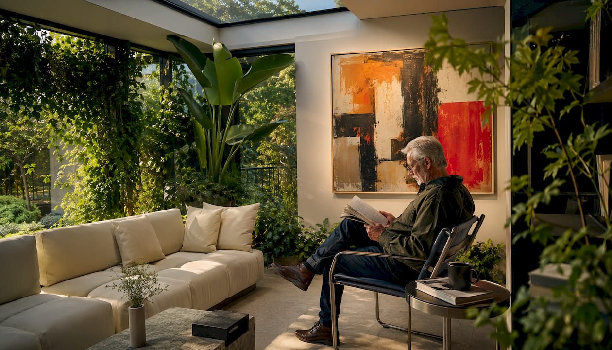
Texture and medium alter perceived warmth, intimacy, and even acoustics in ways that purely visual choices cannot. An oil painting with thick impasto brushwork reads as warm and handmade; a high-gloss metal print of the same image reads as sleek and contemporary. The surface is part of the message.
Common media and their typical effects:
- Canvas (stretched or gallery-wrapped): Warm, approachable, slightly informal. Works well in living rooms and bedrooms.
- Framed giclée print: Precise and refined. The mat and frame choice determines whether it reads as formal or relaxed.
- Metal print: Cool, modern, high-contrast. Strong choice for home offices and contemporary kitchens.
- Wood-mounted print: Organic and grounded. Adds warmth without the softness of canvas.
- Textile art (woven, embroidered, macramé): The most acoustically useful option. Fabric surfaces absorb sound, reducing echo in hard-floored rooms.
- Sculpture and three-dimensional work: Adds shadow and depth that changes with the time of day and light source.
The acoustic dimension is underappreciated. In open-plan spaces with concrete floors and glass walls, a large textile wall hanging can measurably reduce reverberation. The Ambient Art® approach frames this kind of multisensory, calming art experience as intentional design rather than decoration.
Pro Tip: When mixing media in a single display, anchor the arrangement with one dominant material (say, canvas) and introduce one contrasting texture (a small woven piece or a wood-mounted print). Three different materials in equal proportion tend to compete; two in a clear hierarchy tend to cohere.
Pro Tip: For hard-surfaced rooms that echo, prioritize textile art or canvas over metal and glass prints. The acoustic benefit is real and the visual warmth is a bonus.
Lighting and display: making art work harder for the room
Lighting determines whether artwork increases warmth, drama, calm, or neutrality. The same painting under a warm 2700K spotlight feels intimate and golden; under a cool 5000K LED wash, it reads as clinical and flat. Control intensity, direction, color temperature, and glare, and you control the mood the art produces.
A practical checklist for lighting art effectively:
- Aim: Direct the beam at a 30-degree angle from the wall to minimize glare and bring out texture.
- Beam angle: A 15–25 degree narrow spot for a single focused piece; a 35–40 degree flood for a salon wall.
- Color temperature: 2700–3000K for warm, intimate rooms; 3500–4000K for neutral or contemporary spaces.
- Dimming: Install dimmers on art lighting circuits. The ability to drop intensity by 30–40% at night changes the entire room’s mood without touching the art.
- Glare control: Use anti-reflective glazing on framed works, or position lights so the beam does not reflect directly into the viewer’s sightline.
Display style also shapes perceived formality. A floating frame (where the canvas appears to hover inside a shadow-box frame) reads as modern and gallery-like. A wide white mat with a thin black frame reads as classic and considered. A frameless gallery wrap reads as casual and contemporary. Presentation choices affect how seriously a viewer engages with the work before they even look at the image.
Pro Tip: Treat art lighting and room lighting as one system, not two. If your room lighting is warm and low, a cool-white picture light on the art will create a jarring contrast. Match the color temperature of your art lighting to within 500K of your ambient lighting, and the art will feel like it belongs in the room rather than being spotlit in a void.
Why subject matter, memory, and identity matter to ambience
Subject matter influences whether art prompts reflection, energy, comfort, or tension. And personal memory can override every generic color or composition rule. A painting of a coastline you have never visited reads as pleasant; a photograph of a coastline where you spent childhood summers reads as deeply restorative. The depicted content and the viewer’s history with it are inseparable.
Abstract versus representational art produces genuinely different cognitive experiences. Representational works, particularly figurative paintings that depict atmospheric light and scene, can activate multisensory imagination so vividly that viewers report feeling as though they are in the depicted environment. Abstract works, by contrast, invite open-ended attention and tend to sustain engagement longer because the viewer must construct meaning rather than recognize it.
Cultural context modifies these responses significantly. A red field painting reads as festive in one cultural context and as danger in another. A portrait of an ancestor is intimate and grounding for one viewer and unsettling for another. Generic color-emotion rules are starting points, not guarantees.
Practical guidance by room use:
- Rest spaces (bedrooms, reading rooms): Landscapes, soft abstracts, and personal photographs of meaningful places. Avoid high-contrast or visually complex works that demand sustained attention.
- Conversation spaces (living rooms, dining rooms): Figurative works, narrative scenes, or art with enough visual interest to prompt discussion. Art that triggers emotional activation tends to lead to deeper reflection and engagement.
- Focus spaces (home offices, studios): Minimal abstracts or nature scenes. Avoid portraits that create a sense of being watched, which can increase self-consciousness.
What does research say about art’s psychological effects?
Empirical studies show that nature-themed and biophilic art can produce measurable reductions in stress, anxiety, and depression, along with neural and physiological markers consistent with relaxation. This is not anecdotal. The evidence is specific enough to inform design decisions.
A VR and EEG study found that nature-themed artwork produced lower systolic blood pressure and higher alpha-band brain activity in frontal, central, and occipital regions, with restorative scores comparable to real window views of nature and living green plant walls. The implication is direct: where you cannot install a window or a garden, a well-chosen nature print is a physiologically meaningful substitute.
The longitudinal data is equally striking. In a 12-month intervention study of 300 urban residents, the group with regular access to biophilic art installations showed significant improvements on both the PHQ-9 (depression) and GAD-7 (anxiety) scales compared to controls. Mediation analysis attributed 67% of the depression improvement and 72% of the anxiety reduction to attention restoration, stress reduction, and improved environmental perception.
Key finding: In a 12-month study of 300 urban residents, regular access to biophilic art installations produced significant improvements in depression and anxiety, with mediation analysis attributing 67% of the depression improvement and 72% of the anxiety reduction to attention restoration, stress reduction, and enhanced environmental perception.
| Study | Design | Key Finding |
|---|---|---|
| BMC Psychology longitudinal study | 300 urban residents, 12 months | Most of the depression and anxiety improvement attributed to biophilic art exposure |
| Frontiers VR+EEG study | Controlled VR experiment with EEG | Nature art lowered systolic blood pressure and raised alpha-band activity to levels matching real nature views |
| PLOS One audience-emotion study | 883 responses across 37 artworks | Color and size are primary predictors of first emotional impressions, which mediate later cognitive processing |
| Penn Neuroaesthetics review | 25 experimental studies | Realistic nature imagery consistently reduced stress, pain, and anxiety in healthcare settings |
What this means for homeowners and designers:
- Prioritize nature-themed art in rooms with limited windows or no outdoor views.
- In public spaces (lobbies, waiting areas, corridors), realistic landscape imagery outperforms abstract art for stress reduction based on the healthcare evidence.
- The benefits of nature imagery are robust even in brief exposures, making entry halls and waiting areas high-value placement locations.
How to choose art to create a specific mood
Start with the desired emotional outcome, not the artwork. The checklist below moves from intent to execution.
- Define the mood you want. Calm and restorative? Energized and social? Focused and minimal? Write it down before you browse.
- Identify the room’s function. A bedroom used for sleep needs different art than a home office used for deep work. Function determines which emotional register is appropriate.
- Set your color direction. Based on the mood: cool and desaturated for calm, warm and saturated for energy, neutral and low-contrast for focus.
- Choose your scale. One large statement piece for drama and simplicity; a grouped arrangement for warmth and layered interest. Consider the wall’s proportions before deciding.
- Select the medium. Canvas or textile for warmth; metal or high-gloss print for contemporary crispness; framed giclée for formal refinement.
- Pick subject matter that aligns with use. Nature for restoration; abstraction for open-ended engagement; personal photographs for identity and memory.
- Plan the lighting. Decide on color temperature and whether you need a dedicated picture light or track lighting before you hang anything.
- Test before committing. Use a 3D room preview tool, print a scaled paper mockup, or use painter’s tape to mark the dimensions on the wall. What looks right in a browser window often reads differently at scale in a real room.
Questions to ask before buying or commissioning:
- Who uses this room, and what emotional state do they need to be in when they leave it?
- How much natural light does the room get, and at what time of day?
- What is the existing color palette of the walls, furniture, and flooring?
- What is the budget and timeline? Pre-made prints are available immediately and typically run from under $50 to several hundred dollars depending on size and framing. Custom commissions or framed giclée prints from independent artists generally range from a few hundred dollars into the thousands, with lead times of one to four weeks.
Room-by-room guide: which art works where
Each room has a different emotional job, and the art should match it. The table below maps common rooms to the art choices that reliably produce the intended ambience.
| Room | Scale | Subject | Color guidance | Ambience effect |
|---|---|---|---|---|
| Living room | Large single or salon wall | Landscape, figurative, bold abstract | Warm neutrals, accent colors | Social, welcoming, conversation-ready |
| Bedroom | Medium, one or two pieces | Soft landscape, personal photo, minimal abstract | Cool or muted tones | Calm, restorative, intimate |
| Dining room | Medium to large | Still life, figurative, celebratory abstract | Warm, saturated accents | Convivial, appetite-stimulating |
| Entry/hallway | Vertical format, proportional to corridor | Landscape, graphic print, portrait | Bold or welcoming tones | First impression, sets the home’s tone |
| Home office | Small to medium | Nature scene, minimal abstract | Cool neutrals, low contrast | Focus, reduced distraction |
| Public lobby | Large scale, high placement | Biophilic/nature, local landmark, abstract | Neutral with warm accents | Welcoming, stress-reducing, wayfinding |
A few dos and don’ts worth keeping in mind. In bedrooms, avoid high-contrast black-and-white works directly facing the bed; they tend to hold attention when the goal is to release it. In home offices, portraits facing the desk can create a subtle sense of being observed, which some people find motivating and others find distracting. In entry halls, a single strong vertical piece does more work than a cluttered arrangement. For a room-by-room styling approach that goes deeper on each space, the principles above scale to any interior.
How to mix styles and textures without losing coherence
The rule is simple: maintain at least two unifying elements when mixing styles, and the arrangement will hold together. Those elements can be a shared color palette, a consistent frame finish, a repeated scale, or a common texture. Two anchors are enough; you do not need everything to match.
In practice, this looks like: an anchor piece (the largest or most visually complex work) surrounded by supporting pieces that share one of its colors and one of its materials. A large oil painting in warm ochres and deep greens can sit alongside a small woven textile in similar tones and a wood-mounted photograph, because the color palette and the organic material quality tie them together.
Frame choice is a significant variable. Black frames read as modern and graphic; natural wood frames read as warm and organic; white or off-white frames read as gallery-clean and neutral. Mixing frame finishes works when the frames share a finish quality (all matte, all natural, all metallic) even if the colors differ. Mixing a matte black frame with a glossy gold frame in the same arrangement tends to feel unresolved.
Pro Tip: On a budget, the fastest way to unify a mixed-style wall is to reframe everything in the same finish. A set of mismatched prints in identical simple black frames reads as a deliberate collection. The same prints in four different frame styles reads as accumulated clutter.
Key Takeaways
Art shapes ambience through five concrete levers, and nature-themed works carry the strongest evidence for measurable wellbeing benefits. Use the checklist in the choosing section and preview art at scale in your actual room before committing.
| Point | Details |
|---|---|
| Color sets emotional tone | Warm palettes raise energy and coziness; cool palettes signal calm. Apply the 70/30 rule for visual balance. |
| Scale and placement redirect attention | Hang the visual center at 57–60 inches; size single pieces to 60–75% of the wall width they anchor. |
| Texture and medium affect warmth and acoustics | Canvas and textile works add warmth and absorb sound; metal and glass prints read as crisp and modern. |
| Nature-themed art has measurable benefits | A 12-month study found biophilic art reduced anxiety and depression in a substantial share of participants. |
| Artify enables custom sizing and room previews | Upload a photo or browse pre-made collections, choose size and frame, and preview in a 3D room view before ordering. |
Art placement is more deliberate than most people realize
The conventional advice is to hang art you love and let the room follow. That sounds freeing, but it sidesteps the real question: what do you want the room to do for the people in it?
The research on biophilic art is not a fringe finding. A longitudinal study with 300 participants and standardized clinical measures found that sustained exposure to nature-integrated art environments produced improvements in depression and anxiety that strengthened progressively over 12 months. That is not a decorating tip. That is evidence that the art on your walls is doing something to your nervous system whether you are paying attention to it or not.
What most guides miss is the interaction between subject matter and personal memory. Generic color rules predict average responses across populations. Your response to a specific image is shaped by everything you associate with it. A painting of a mountain range means something different to someone who grew up hiking than to someone who has never left a city. That personal layer is not a complication to work around. It is the most powerful tool you have, and it is the reason custom and personally meaningful art tends to outperform even technically well-chosen generic prints in terms of how a room actually feels to live in.
The practical takeaway: start with the research-backed defaults (nature themes for restoration, cool tones for calm, warm tones for energy), then override them deliberately with personal meaning where it applies. That combination produces ambience that is both physiologically grounded and emotionally specific to the people who live there.
What if you could see the art in your room before you buy it?
Artify produces gallery-quality custom prints sized and framed to reinforce exactly the ambience you are trying to create. Upload a personal photograph and have it transformed into a fine art print by an independent artist, or browse curated pre-made collections organized by mood, palette, and style. Every order includes a 3D room preview so you can see the piece at scale on your actual wall before committing.
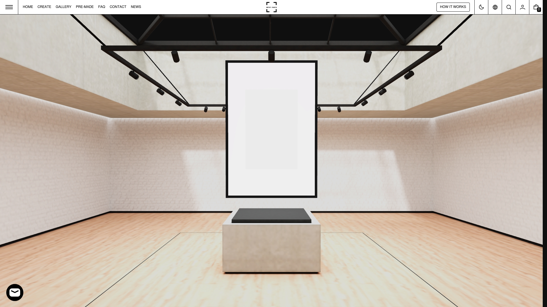
The framing options cover the full range: canvas gallery wraps for a warm, contemporary feel; museum-grade giclée prints with custom mat and frame combinations for a more formal presentation; and a variety of sizes that go well beyond what you find in standard retail. The process is straightforward: choose or upload, select size and frame, preview in the room, and order. See the full gallery for finished examples across styles and spaces, or visit the how it works page to start.
Sources and further reading
The studies and essays below are the primary sources behind the wellbeing and psychological claims in this article.
- BMC Psychology longitudinal study — 12-month intervention with 300 urban residents; provides the strongest longitudinal evidence for biophilic art’s effects on depression and anxiety using PHQ-9 and GAD-7 measures.
- Frontiers VR+EEG study — controlled experiment using VR environments and EEG; provides neural and physiological data showing nature art produces restorative effects comparable to real nature views.
- PLOS One audience-emotion study — analysis of 883 audience responses across 37 artworks; establishes that color and size are primary predictors of first emotional impressions and subsequent cognitive processing.
- Penn Neuroaesthetics review — critical narrative review of 25 experimental studies on visual art in healthcare; synthesizes evidence for nature imagery’s consistent stress, pain, and anxiety reduction benefits.
- Estetika: Multisensory Experience of Paintings — phenomenological analysis of how figurative paintings activate multisensory imagination; theoretical grounding for the subject matter and atmosphere sections.
- Affective Spaces: Experiencing Atmosphere in the Visual Arts — scholarly essay on atmospheric perception in painting and installation art; useful for understanding the difference between immersive and reflective art experiences.
- Ambient Art® — The Catherine Mayer Foundation — describes the Ambient Art® approach as a multisensory, calming art experience; illustrative example of intentional sensory design in art.
FAQ
What is ambience in art?
Ambience in art refers to the atmospheric quality a work produces in its environment, shaped by color, scale, subject matter, lighting, and medium. Scholarly analysis describes it as a form of atmospheric perception through which viewers engage with a work’s mood as much as its imagery.
What is the 70/30 rule in art?
The 70/30 rule is a composition guideline where 70% of the visual field is dominated by a unifying element and 30% by contrasting accents, creating visual hierarchy without visual noise. It applies equally to a single artwork and to a grouped wall display.
How does art impact creativity and focus?
Nature-themed art and minimal abstracts tend to lower cognitive load and reduce stress, which creates the physiological conditions for sustained focus. The VR and EEG research found that nature art raised alpha-band brain activity, a neural marker associated with relaxed alertness.
Does the subject matter of art really change how a room feels?
Yes. Representational works depicting atmospheric scenes can activate multisensory imagination so strongly that viewers report feeling as though they are in the depicted environment. Personal photographs add another layer: memory associations can override generic color or composition effects entirely, making personally meaningful art among the most powerful ambience tools available.
How can I preview art before hanging it?
Use a 3D room preview tool, print a scaled paper mockup, or mark the dimensions on the wall with painter’s tape before committing. Artify’s platform includes a 3D room preview feature that lets you see a piece at your chosen size on your actual wall before you place an order.