


TL;DR:
- Choosing wall art requires selecting appropriately sized pieces that balance with furniture and hang at standard eye level. Personal meaningfulness enhances a room’s emotional impact, making the space more memorable and timeless. Proper planning, measurement, and color coordination are essential for creating a cohesive and attractive display.
Choosing wall art is the process of selecting pieces that reflect your personality and harmonize with your home’s decor. Get it right, and a room feels finished, intentional, and alive. Get it wrong, and even expensive furniture looks incomplete. This guide covers the core principles of art selection: sizing rules, color coordination, hanging techniques, and personal meaning. Whether you are decorating a living room for the first time or refreshing a space that never quite clicked, these principles give you a clear framework to work from.
How to choose wall art: size and placement rules that actually work
Size is the most common mistake people make when selecting wall decor. A piece that is too small floats on the wall like a postage stamp. A piece that is too large crowds the room and competes with everything else.
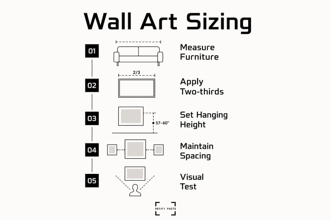
The industry standard is the two-thirds rule: artwork should occupy 60% to 75% of the furniture width beneath it. For a 90-inch sofa, that means targeting artwork around 60 inches wide. This rule keeps the art anchored to the furniture rather than floating in empty space above it.
Hanging height matters just as much as size. Standard gallery installations center artwork at 57 to 60 inches from the floor, which aligns with average eye level. That number comes from museum practice, and it works in homes for the same reason: your eye finds the art naturally without tilting up or down.
When art hangs above a sofa, console, or bed, leave 15 to 20 cm between the top of the furniture and the bottom of the frame. That gap creates a visual connection between the art and the furniture below it. Any more space and the art looks like it belongs to the ceiling, not the room.
Pro Tip: Before buying anything, cut paper to the exact dimensions of the piece you are considering and tape it to the wall. Physical mockups reveal whether art will feel lost or dwarfed in the space, and they cost nothing.
Sizing guidelines by furniture type
| Furniture | Recommended art width | Hanging gap |
|---|---|---|
| 90-inch sofa | 54–67 inches | 15–20 cm above sofa back |
| Queen bed (60 inches) | 36–45 inches | 15–20 cm above headboard |
| Console table (48 inches) | 29–36 inches | 15–20 cm above surface |
| Dining table (72 inches) | 43–54 inches | Center at 57–60 inches from floor |
What colors and styles work best for your room?
Color coordination is the second place people go wrong. The fix is simpler than most decorating guides suggest. Pull a subtle accent color from something already in the room: a throw pillow, a plant pot, a trim color, or a rug. Art that echoes existing tones creates unity without looking matchy or forced.
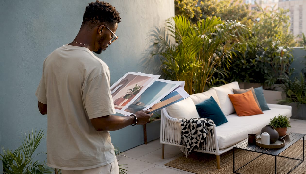
Art should contrast with the wall behind it, not blend into it. A warm ochre print on a white wall pops. The same print on a yellow wall disappears. The goal is harmony with the room’s palette and contrast with the immediate background.
Style follows mood. A calm bedroom calls for soft abstracts, muted landscapes, or line drawings. A vibrant living room can carry bold color-field prints or graphic photography. A moody study suits dark botanical illustrations or monochrome portraits. Match the art’s energy to the energy you want the room to hold.
Price point does not have to be uniform. Mixing a single investment piece with lower-cost prints adds character and avoids the “catalog room” look where everything feels purchased as a set. The investment piece anchors the wall; the supporting prints add depth.
Understanding how color choices affect a room helps you make confident decisions before you commit to a purchase.
Color coordination strategies:
- Pull one color from existing textiles and repeat it in the artwork
- Choose art that contrasts with the wall color for visibility
- Use a neutral frame to let a colorful print breathe
- Limit the palette to three colors across a gallery wall for cohesion
- Test art colors under the room’s actual lighting before buying
Pro Tip: Take a photo of your room and use it as a reference when browsing art online. Colors that look right in isolation often clash or disappear in context.
How do you hang and arrange wall art like a professional?
Hanging art well is a skill, but the steps are repeatable. The wall art in interior design principles that professionals use come down to planning before drilling.
Follow these steps for a clean, professional result:
- Measure the wall space. Note the width and height available, accounting for furniture below and ceiling height above.
- Create paper templates. Cut paper to the exact size of each piece and label them. Tape them to the wall with painter’s tape.
- Arrange the templates. Shift them around until the layout feels balanced. Step back and view from the room’s entry point.
- Mark your hanging points. Use a pencil to mark where each hook or nail will go directly through the template.
- Check your spacing. For gallery walls, maintain uniform gaps of 5 to 8 cm between frames regardless of frame size or orientation. Consistent gaps prevent a chaotic appearance.
- Choose the right hardware. Heavy frames need wall anchors. Lightweight prints work with adhesive strips or picture hooks. Match the hardware to the wall material and frame weight.
- Hang and level. Use a spirit level on every piece. A slightly crooked frame pulls the eye away from the art itself.
When mixing frame sizes and orientations in a gallery arrangement, anchor the layout with the largest piece first. Build outward from that anchor, alternating landscape and portrait orientations to create visual rhythm. Odd numbers of pieces tend to feel more natural than even groupings.
Why does personal meaning matter when picking art?
Art chosen for personal meaning makes a room memorable. Art chosen because it was on sale makes a room forgettable. That distinction sounds obvious, but most people default to generic prints because they feel “safe.” Safe art rarely moves anyone, including the person who lives with it every day.
Art with personal resonance creates emotional connection. A photograph of a place you love, a print of a symbol that matters to you, or a portrait of a pet you have lost all carry weight that a stock landscape cannot replicate. That weight is what makes a room feel like yours rather than a showroom.
Personal art also ages better. Trend-driven prints look dated within a few years. A piece tied to a memory or value stays relevant because its meaning is not borrowed from a trend cycle.
Ways to bring personal meaning into your art selection:
- Commission a custom print from a photograph of a meaningful place or person
- Choose art by an artist whose story or background resonates with you
- Select imagery tied to a hobby, culture, or chapter of your life
- Mix one deeply personal piece with more neutral supporting prints
- Use Artify’s custom art tools to turn a personal photograph into a gallery-quality piece
Mixing personal pieces with styled prints is not a contradiction. One anchor piece with strong personal meaning can carry a whole wall, even when surrounded by more decorative supporting art.
Key Takeaways
Choosing wall art well requires sizing to furniture, coordinating color with existing decor, planning placement before hanging, and selecting pieces with genuine personal meaning.
| Point | Details |
|---|---|
| Follow the two-thirds rule | Art should span 60%–75% of the furniture width beneath it for visual balance. |
| Hang at eye level | Center artwork 57–60 inches from the floor to align with standard viewing height. |
| Pull colors from the room | Echo one existing accent color in your art to unify the palette without matching exactly. |
| Plan before you drill | Tape paper templates to the wall to test scale and layout before committing. |
| Choose art with meaning | Personal pieces age better and make a room feel genuinely yours rather than generic. |
What I have learned from watching rooms come alive with the right art
The most common mistake I see is treating art as the last decision. People finish a room, look at the bare walls, and then go shopping. That order produces art that fits the budget left over, not the room in front of you.
Art should be part of the room’s plan from the start. Choosing art without considering furniture, lighting, and room use is the single biggest reason art fails in a space. A piece that would be stunning in one context looks wrong in another because the system around it was never considered.
Natural light is the factor most people ignore entirely. Direct sunlight damages works on paper and causes fading over time. Canvases handle light and glare better. If a wall gets strong afternoon sun, choose a canvas print or use UV-protective glazing. A museum-grade approach to materials extends the life of your art significantly.
Scale surprises people more than any other variable. A piece that looks enormous in a store looks modest on a 12-foot wall. Always test with paper templates before buying. The five minutes that step takes saves hours of patching holes and returning art.
The rooms that feel most alive are the ones where at least one piece of art was chosen for love, not logic. Logic gets you the right size and the right color. Love gets you the piece you cannot stop looking at.
— Artify
Artify’s curated collections make the selection process simpler
Finding art that fits your space, style, and story is easier when the options are curated rather than endless. Artify brings together gallery-quality prints, independent artist collections, and custom art tools in one place.
Browse Artify’s pre-made collections to find ready-to-hang pieces organized by style, mood, and color palette. Each collection is curated to work as a cohesive set or as individual statement pieces. If you want something more personal, Artify’s custom art tools let you upload a photograph and choose from a range of artistic styles, with framing options and a 3D room preview so you can see the piece in your space before ordering. Independent artists back every piece, so your purchase supports real creative work.
FAQ
What is the two-thirds rule for wall art?
The two-thirds rule states that artwork should span 60% to 75% of the furniture width beneath it. For a 90-inch sofa, that means choosing art around 60 inches wide.
How high should wall art be hung?
Center artwork at 57 to 60 inches from the floor. This aligns with average eye level and follows standard gallery installation practice.
How do I choose art colors that match my room?
Pull one accent color from existing textiles, frames, or decor objects and repeat it in the artwork. Art should contrast with the wall color behind it while harmonizing with the room’s overall palette.
How much space should I leave between art and furniture?
Leave 15 to 20 cm between the top of the furniture and the bottom of the frame. This gap connects the art visually to the furniture below it.
What spacing works best for a gallery wall?
Maintain uniform gaps of 5 to 8 cm between frames regardless of frame size or orientation. Consistent spacing creates a cohesive, professional look.