

TL;DR:
- Art arrangement transforms wall displays into intentional, balanced compositions by applying key principles like eye-level placement, spacing, and focal points. Using kraft paper templates and measuring tools ensures precise installation, while varying frame sizes and mediums adds visual interest. Regular adjustments and personal meaning keep gallery walls lively and cohesive in the home.
Art arrangement is the practice of grouping and positioning artwork on a wall to create a unified, intentional display rather than a random collection of frames. Knowing how to create art arrangements transforms bare walls into focal points that reflect your personality and anchor a room’s design. The core principles, visual weight, spacing, and focal point selection, apply whether you are hanging two pieces above a sofa or building a full salon-style gallery wall. This guide covers the tools, techniques, and room-specific rules professionals use to get it right the first time.
What tools and materials do you need for art arrangements?
The right tools prevent crooked frames, damaged walls, and wasted time. Gather everything before you start, and the physical installation becomes straightforward.
Measuring and planning tools:
- Steel tape measure (for wall width, furniture width, and ceiling height)
- Kraft paper or brown paper roll (for making full-size frame templates)
- Pencil and painter’s tape (for marking positions without permanent marks)
- Level or laser level (to keep rows straight)
- Ruler or straightedge (for spacing checks)
Hanging hardware:
- Picture hooks and nails rated for your frame weights
- Wall anchors or toggle bolts for drywall without studs
- D-ring hangers and wire for heavier frames
- Command strips (for lightweight pieces only, under 5 lbs)
| Tool | Purpose |
|---|---|
| Kraft paper templates | Test layout on the wall before any nails go in |
| Steel tape measure | Confirm furniture and wall dimensions |
| Laser level | Keep multi-row arrangements perfectly horizontal |
| Wall anchors | Support heavier frames on drywall safely |
| Painter’s tape | Mark center points and frame edges without damage |
Pro Tip: Label each kraft paper template with the hardware position on the back. When you tape it to the wall, you can hammer the nail straight through the paper, then tear it away. This method, used by professional installers, eliminates guesswork entirely.
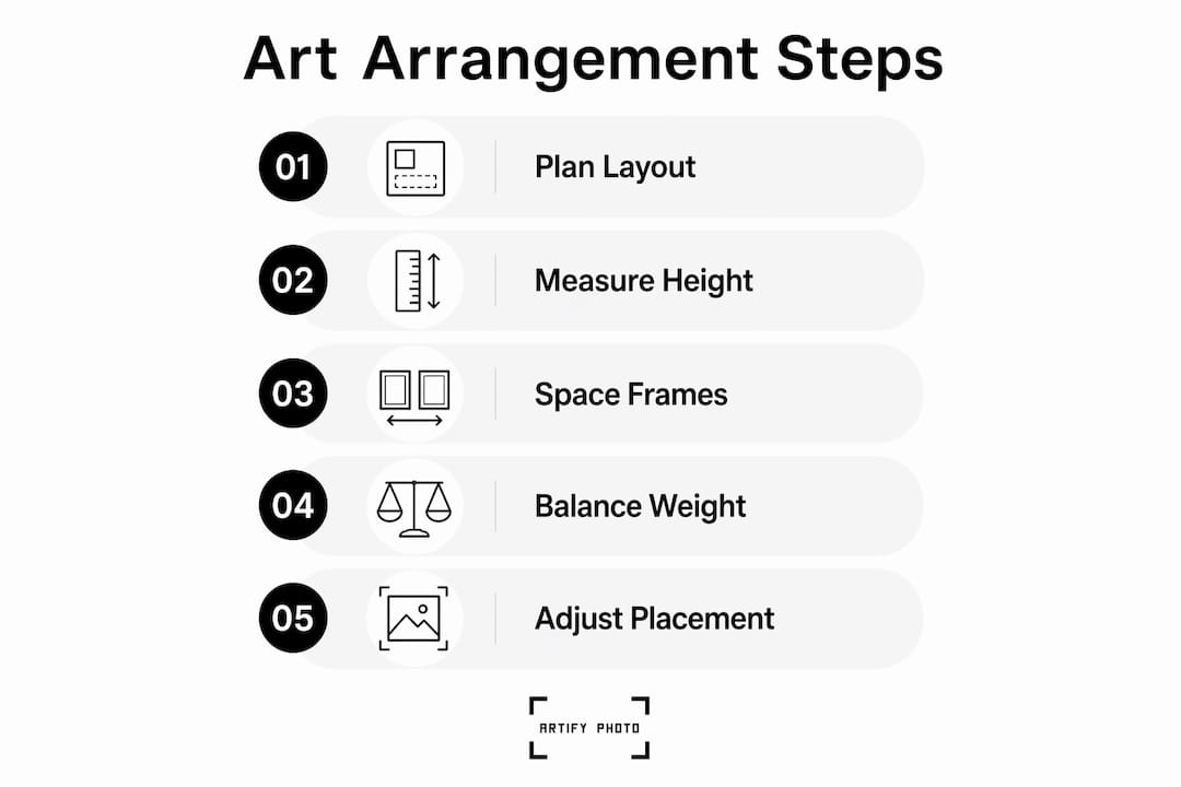
How to plan and layout art arrangements: key design principles
Planning on paper before touching a nail is the single habit that separates polished displays from cluttered ones. Kraft paper templates let you move pieces around freely and test spacing without leaving a single hole in the wall.

The eye-level rule
The center of your arrangement should sit 57–60 inches from the floor. That range matches average standing eye level and is the standard used in museums and professional galleries. Apply this rule to the center of the entire grouping, not to each individual frame.
Spacing between frames
A uniform gap of 2–3 inches between frames creates a curated, intentional look. Gaps wider than 4 inches break the visual connection between pieces. The arrangement starts to read as separate objects rather than a single composition.
Choosing a layout shape
Three layout shapes work for most rooms:
- Grid layout. All frames are the same size and aligned in rows and columns. This style suits modern and minimalist interiors. It works best with a consistent subject matter or color palette.
- Salon style. Frames of mixed sizes fill the wall edge to edge with tight spacing. This is the most expressive format and suits eclectic or maximalist rooms. Start with the largest piece at center and build outward.
- Asymmetrical layout. A loose grouping that follows an implied shape, such as a horizontal rectangle or an arch. This format suits transitional and contemporary spaces and feels less rigid than a grid.
Visual weight and focal points
Visual weight describes how heavy or dominant a piece feels to the eye. Dark frames, large prints, and high-contrast images carry more visual weight than light, small, or muted pieces. Place the heaviest piece at the center or slightly left of center, since the eye reads left to right and expects the dominant element near the start.
Pro Tip: Step back and squint at your paper template layout on the wall. The squint test blurs detail and forces you to read the arrangement as a single mass. If it looks balanced and unified when blurred, it will look cohesive when sharp.
What are the best practices for arranging art above furniture?
Room context changes everything about how an arrangement should be built. A layout that works in a hallway will feel wrong above a dining table.
Art width above furniture
Art or an arrangement should span 60%–75% of the furniture’s width beneath it. A sofa that is 84 inches wide calls for an arrangement roughly 50–63 inches wide. Going narrower makes the art look lost. Going wider makes the furniture look small.
Room-specific guidance
- Living room. Use a salon-style or asymmetrical layout above the sofa. Mix one large anchor piece with smaller supporting works. Keep the bottom of the lowest frame at least 6–8 inches above the sofa back.
- Hallway. A horizontal grid or single-row arrangement works best in narrow spaces. Stick to portrait-oriented frames to echo the vertical proportions of the corridor. Check out Artify’s room-by-room style guide for specific layout ideas by space.
- Bedroom. Center a single large piece or a tight triptych above the headboard. The arrangement should feel calm and grounding, so limit the number of pieces to three or five.
Mixing mediums and frames
Mixing mediums such as mirrors, textiles, and ceramics into a gallery wall adds depth and dimension that flat prints alone cannot achieve. A mirror reflects light and makes the arrangement feel dynamic. A ceramic plate or woven piece adds texture. Explore gallery wall ideas that incorporate these mixed elements for inspiration.
Using all identical frame sizes diminishes impact. Vary frame sizes and materials, pairing a wide black metal frame with a narrow natural wood one, to create the contrast that holds a viewer’s eye.
Pro Tip: Avoid matching every frame to your furniture finish. Art that complements rather than matches the room creates visual interest. Matching creates a showroom look that feels flat and impersonal.
How to install and adjust your art arrangement safely
With your layout tested on paper templates, the physical installation follows a clear sequence.
- Mark your center point. Measure 57–60 inches from the floor and mark the center of your arrangement with a pencil dot. This is your anchor for everything else.
- Tape templates to the wall. Use painter’s tape to fix each kraft paper template in its planned position. Step back and confirm the layout reads as intended before committing.
- Mark hardware positions. Press through the paper at each hook or nail position with a pencil or nail tip. Remove the templates.
- Install hanging hardware. For lightweight pieces, picture hooks and nails are sufficient. For heavy or glass-covered frames, use wall anchors or specialized brackets. Command strips are only appropriate for pieces under 5 lbs.
- Hang and level each piece. Use a level on every frame after hanging. A single crooked frame pulls the eye away from the whole arrangement.
- Step back and evaluate. View the finished arrangement from the room’s natural entry point. Adjust any piece that feels off before the nail holes multiply.
Art arrangements are not permanent. Professionals treat every installation as a starting point and revisit the layout after living with it for a few weeks. Periodic re-hangs refresh a room’s character and let the arrangement evolve over time.
When incorporating non-art objects like mirrors or ceramic pieces, treat them as frames in your layout plan. Give them the same spacing rules and include them in your paper template stage. A mirror placed at the edge of a salon wall bounces light across the other pieces and adds a practical function to the display.
Key Takeaways
The most effective art arrangements combine the 57–60 inch eye-level rule, 2–3 inch frame spacing, and a 60%–75% furniture width ratio to create displays that feel intentional and balanced.
| Point | Details |
|---|---|
| Use the eye-level rule | Hang the center of your arrangement 57–60 inches from the floor for optimal viewing. |
| Keep spacing tight | Maintain 2–3 inch gaps between frames to read as one unified composition. |
| Match furniture width | Art arrangements should span 60%–75% of the furniture width beneath them. |
| Test before nailing | Use kraft paper templates taped to the wall to finalize layout without damage. |
| Mix sizes and mediums | Vary frame sizes and incorporate mirrors or textiles to add depth and lasting interest. |
Artify’s take on arrangements that actually last
The most common mistake I see is treating art arrangement as a one-time decorating task. People hang their pieces, step back, and consider it done. The rooms that feel genuinely alive are the ones where the arrangement has been adjusted, swapped, and rethought over months.
Art chosen to express personal stories creates cohesion that purely decorative choices never achieve. When a piece has meaning, it anchors the arrangement emotionally, not just visually. That emotional anchor is what makes a gallery wall feel like it belongs to the home rather than to a catalog.
The practical advice I give most often: start with fewer pieces than you think you need. A tight grouping of three strong works beats a sprawling wall of ten mediocre ones every time. You can always add. Subtracting is harder once you have committed to the holes.
Frame variety matters more than most guides admit. Two pieces of identical size in matching frames flatten the display. Introduce one oversized print, one small square, and one portrait-oriented piece, and the arrangement immediately gains rhythm. That rhythm is what the eye follows, and it is what makes someone stop and look rather than glance and move on.
— Artify
Start your arrangement with Artify
Choosing the right art is the foundation of any great arrangement. Artify’s pre-made collections are curated with layout in mind, so pieces within each collection are designed to work together in size, palette, and style. You can browse collections built around contemporary trends, landmarks, and pop culture, or upload your own photographs to create custom prints that carry personal meaning.
Artify also offers 3D room previews and personalized framing options, so you can see how a piece fits your actual wall before ordering. If you need guidance on the creation process, Artify’s art creation help center walks you through every step from upload to delivery.
FAQ
What is the correct height to hang art arrangements?
The center of the arrangement should sit 57–60 inches from the floor. This matches average eye level and is the standard used in professional galleries.
How much space should I leave between frames?
Professionals recommend 2–3 inches between frames. Gaps wider than 4 inches break the visual connection and make the arrangement read as separate pieces rather than a unified display.
How wide should art be above a sofa or console?
Art or an arrangement should span 60%–75% of the furniture’s width beneath it. For an 84-inch sofa, that means an arrangement roughly 50–63 inches wide.
Can I use Command strips for a gallery wall?
Command strips work only for lightweight pieces under 5 lbs. For heavier or glass-covered frames, use wall anchors or brackets to prevent shifting or wall damage over time.
What is the squint test in art arrangement?
The squint test involves stepping back and squinting at your arrangement to blur the detail. If the grouping reads as a single unified mass rather than disconnected objects, the layout has strong visual cohesion.