

TL;DR:
- Effective art styling involves selecting appropriately sized artwork, maintaining consistent spacing and framing, and using layered lighting to enhance visual impact. Pulling a cohesive color palette from a single focal piece ensures harmonious room design and intentional display. Proper planning, including floor layout and precise measurements, helps create a gallery wall that feels deliberate and polished.
Styling art spaces is the deliberate practice of combining artwork selection, placement, scale, and lighting to create cohesive, visually engaging interiors. Done well, it transforms a blank wall into a personal statement and a room into a space that feels intentional. The core tools are simple: a measuring tape, painter’s tape, and the right lighting fixtures. But the principles behind how to style art spaces separate a thoughtful display from a random collection of frames. This guide walks you through every step, from sizing your first piece to lighting your finished gallery wall.
How to style art spaces: sizing and selecting the right artwork
The most common mistake in art selection is choosing a piece that is too small for the wall. A single artwork should cover 60–75% of the width of the furniture it hangs above. For a standard 84-inch sofa, that means artwork between 50 and 63 inches wide, with 6–10 inches of vertical space between the sofa back and the bottom of the frame. That gap keeps the piece connected to the furniture without crowding it.
Scale also shifts by room function and ceiling height. A bedroom calls for softer, more intimate sizing. An entryway with a 10-foot ceiling can handle a dramatically tall vertical piece that draws the eye upward. The wall art trends for 2026 lean toward oversized single statements in living rooms and layered gallery arrangements in hallways and home offices.
Matching style and frame consistency
Frame consistency is the fastest way to make a mixed collection look curated. You do not need identical frames, but you do need a shared logic. Black frames with white mats create a clean, modern gallery feel. Natural wood frames work across bohemian, Scandinavian, and earthy interiors. Mixing metal and wood frames in the same arrangement reads as chaotic unless the artwork itself provides a strong unifying thread.
Style cohesion follows the same rule. Pairing abstract expressionism with photorealistic portraits rarely works unless the color palettes overlap. Choosing pieces from a single genre, such as botanical prints, black-and-white photography, or contemporary illustration, makes the arrangement feel intentional. Artify’s guide on types of wall art breaks down materials and styles to help you identify which combinations hold together visually.
Here is a practical sizing checklist before you buy:
- Measure the wall width and the furniture width below it.
- Calculate 60–75% of the furniture width as your target artwork width.
- Confirm the ceiling height supports the vertical scale you are considering.
- Check that frame finish matches at least one other element in the room (hardware, furniture legs, light fixtures).
- Verify the art style shares a color or genre thread with adjacent pieces.
What are the best professional techniques for arranging art?
Gallery wall center height sits at 57–60 inches from the floor, which aligns with average eye level. This is the visual center of the arrangement, not the top edge of the tallest frame. Most people hang art too high, which disconnects it from the furniture and the human experience of the room.
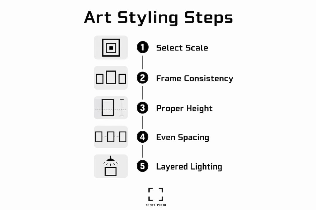
Spacing between frames functions as rhythm, not just measurement. Consistent 2–3 inch gaps between frames create a unified composition. Two-inch gaps read as tight and modern. Three-inch gaps feel more open and work better when mixing large and small pieces. Inconsistent gaps introduce visual noise that disrupts harmony even when the heights are correct.
Common gallery wall layout styles
Choosing one layout method and committing to it produces a coherent arrangement rather than a visually confused jumble. The four most common styles are:
- Grid layout: Identical frames in uniform rows and columns. Works best with photography or prints of the same series.
- Salon style: Mixed sizes arranged edge-to-edge with no strict alignment. Feels collected and layered, best for eclectic interiors.
- Linear layout: All frames aligned along a single horizontal axis. Clean and architectural, ideal for hallways.
- Anchored layout: One large statement piece with smaller works radiating around it. The anchor piece should be at least 50% larger than adjacent pieces to hold the eye.
| Layout Style | Best Room | Visual Effect |
|---|---|---|
| Grid | Home office, bedroom | Structured, modern |
| Salon style | Living room, staircase | Layered, personal |
| Linear | Hallway, dining room | Clean, architectural |
| Anchored | Living room, entryway | Focal, dramatic |
Pro Tip: Alternate vertical and horizontal frames in roughly a 60/40 ratio to create visual rhythm. All vertical frames feel anxious. All horizontal frames feel flat. The mix creates natural flow.
Before drilling a single hole, trace each frame on kraft paper, cut out the templates, and tape them to the wall with painter’s tape. Planning this way takes about two hours but prevents the regret of misaligned or off-feeling arrangements. Step back, live with the layout for a day, and adjust before committing.
How does lighting affect the look of your art display?
Lighting is the most underestimated variable in art display. The correct approach is layered lighting: ambient light fills the room, and targeted accent or picture lights focus on individual pieces. Without accent lighting, even a well-arranged gallery wall reads as flat during evening hours.
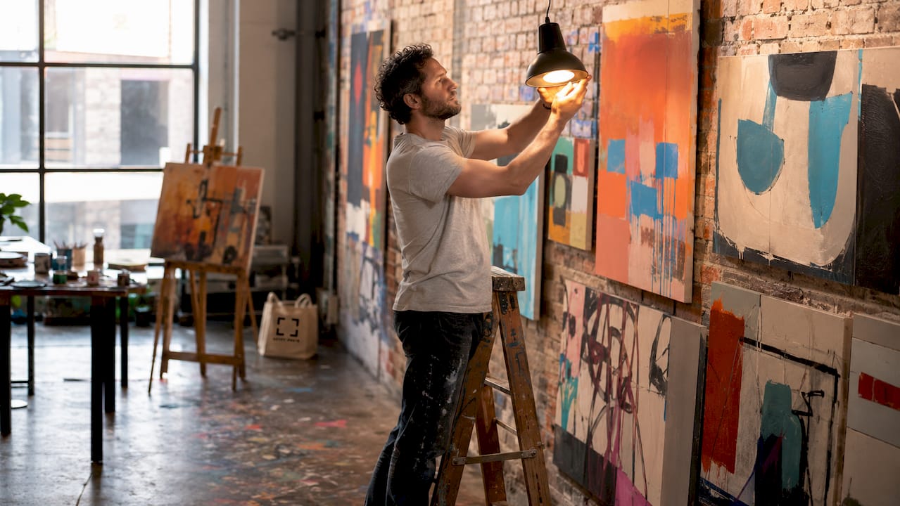
The ideal fixture angle is 30°–45° from the wall surface. Fixtures with a CRI of 90 or higher and a color temperature between 3000K and 4000K preserve pigment accuracy and render colors as the artist intended. Lower CRI bulbs shift warm tones toward yellow and cool tones toward gray, which distorts the artwork’s intended palette.
Glare control comes from adjusting the angle and tilt of the fixture, not from dimming the bulb. Changing the fixture angle is more effective than adjusting brightness for eliminating hotspots on canvas or glass. Aim for an even wash across the surface.
Building a color palette around your art
Color cohesion starts with one anchor piece. Pulling the palette from a single inspiring artwork simplifies every subsequent styling decision. Once you identify the dominant, secondary, and accent colors in that piece, apply them across the room using the 60/30/10 proportion framework:
- 60%: Dominant color on walls and large furniture surfaces.
- 30%: Secondary color on textiles, rugs, and upholstery.
- 10%: Accent color in accessories, throw pillows, and smaller decor objects.
This proportion keeps the room from feeling chaotic while letting the art remain the focal point. A painting with deep navy, warm terracotta, and cream translates directly into a wall color, sofa fabric, and ceramic vase palette.
Pro Tip: If you are unsure where to start, Artify’s guide on art and home personalization shows how a single statement piece can anchor an entire room’s color story.
What practical steps make art styling go smoothly?
A clear process prevents the two most common failures: hanging art too high and spacing it unevenly. Follow this sequence for any art styling project:
- Measure first. Record wall width, furniture width, and ceiling height before selecting any art.
- Select and group pieces by style, frame finish, or color family before deciding on placement.
- Lay everything out on the floor in the arrangement you plan to hang. This reveals proportion problems before you touch the wall.
- Create paper templates for each frame and tape them to the wall at the correct center height (57–60 inches from the floor).
- Adjust spacing until all gaps are consistent at 2–3 inches. Use a ruler, not your eye.
- Mark nail positions through the templates, then remove the paper and drill.
The most common pitfalls are uneven spacing (which reads as careless), hanging the center too high (which disconnects art from the room), and mixing too many frame finishes without a unifying logic. Each of these is fixable before you drill if you follow the template step.
Clear organization of your art space also matters beyond the wall itself. Defined zones for storage, display, and work reduce clutter and make the space easier to maintain and refresh. Rotating pieces every six to twelve months keeps the room feeling alive without requiring a full redesign. Exploring portrait vs. landscape orientation choices when you rotate can shift the entire energy of a wall.
Pro Tip: Photograph your floor layout before taping templates to the wall. If you second-guess the arrangement mid-installation, the photo gives you an exact reference to return to.
Key takeaways
Effective art styling combines correct scale, consistent spacing, intentional lighting, and a color palette pulled from one anchor piece.
| Point | Details |
|---|---|
| Size artwork to furniture | Art should cover 60–75% of the furniture width it hangs above for balanced scale. |
| Center at eye level | Position the visual center of any display at 57–60 inches from the floor. |
| Space frames consistently | Use 2–3 inch gaps between frames to create rhythm and visual unity. |
| Light at the right angle | Aim fixtures at 30°–45° with CRI 90+ bulbs to preserve color accuracy and reduce glare. |
| Build color from one piece | Pull your room’s 60/30/10 color palette from a single anchor artwork for cohesion. |
What Artify has learned about styling art spaces
The advice that gets skipped most often is the floor layout step. People look at a wall, eyeball the spacing, and start drilling. Then they spend an hour filling holes. Laying every piece on the floor first feels slow, but it is the single step that separates a display that looks considered from one that looks accidental.
Bold art statements work best when the surrounding space is calm. A large, high-contrast abstract piece needs breathing room. Crowding it with competing decor, busy textiles, or too many smaller frames dilutes its impact. The art should win the room. Everything else supports it.
Lighting is where most home stylists underinvest. A well-chosen piece on a poorly lit wall looks flat. The same piece under a properly angled picture light with a CRI 90+ bulb looks like it belongs in a gallery. The fixture cost is modest. The difference is not.
Refreshing art regularly is not a sign of indecision. It is how you keep a space feeling current and personal. Swapping one or two pieces per season, or rotating a gallery wall to reflect a new color direction, costs nothing if you already own the art. The wall becomes a living part of the home rather than a fixed backdrop.
— Artify
Find the right art for your space at Artify
Knowing the principles is only half the work. Finding art that fits your palette, scale, and style is where most people stall.
Artify’s pre-made collections are organized by theme, color family, and room type, which makes it straightforward to find pieces that match the anchor artwork approach described above. If you want something built around your own photographs, the creating your art guide walks you through every step from upload to framed print. Browse the full pre-made artworks catalog to see the complete range of styles available, from abstract expressionism to contemporary portraiture, all produced by independent artists and ready to ship.
FAQ
What is the two-thirds rule for wall art sizing?
The two-thirds rule states that artwork should cover roughly 60–75% of the width of the furniture below it. For an 84-inch sofa, the ideal artwork width is 50–63 inches.
How high should you hang art on a wall?
The visual center of any artwork or gallery wall arrangement should sit at 57–60 inches from the floor, which aligns with average eye level. Hanging higher disconnects the art from the furniture and the viewer.
What spacing should you use between gallery wall frames?
A consistent 2–3 inch gap between frames creates visual unity. Two-inch gaps feel tight and modern; three-inch gaps feel more open and suit mixed-size arrangements.
What lighting is best for displaying artwork at home?
Use fixtures with CRI 90 or higher and a color temperature of 3000K–4000K, angled at 30°–45° from the wall surface. This combination preserves color accuracy and eliminates glare without dimming the piece.
How do you build a color palette for an art space?
Start with one anchor artwork and identify its dominant, secondary, and accent colors. Apply those colors across the room using the 60/30/10 proportion: 60% on walls and large furniture, 30% on textiles, and 10% on accessories.