

TL;DR:
- Choosing the right orientation for wall art significantly influences a room’s visual balance, with portrait emphasizing height and landscape highlighting width. Proper size and placement, guided by furniture dimensions and room architecture, ensure the artwork enhances its surroundings effectively. Mixing orientations within gallery walls creates dynamic visual interest, while personal connections to the art remain the foundation for successful display.
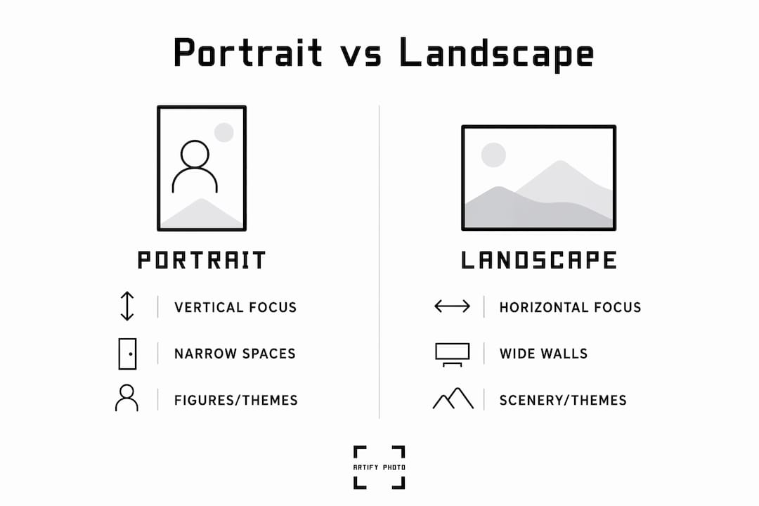
Portrait vs. landscape wall art refers to the orientation of a piece: portrait is taller than wide, while landscape is wider than tall. Each orientation creates a fundamentally different visual effect in your home, and choosing the wrong one for a given wall or room can undermine an otherwise well-designed space. Interior designers like Kit Kemp and platforms like Artify and Urban Road Australia treat orientation as a primary design variable, not an afterthought. Understanding how each format shapes spatial perception is the fastest way to make confident, lasting decisions about your walls.
How portrait vs. landscape wall art shapes room aesthetics
The core difference between the two orientations is directional energy. Portrait art pulls the eye upward, creating a sense of height and vertical emphasis. Landscape art pulls the eye sideways, creating breadth, calm, and a feeling of openness. Urban Road Australia confirms that landscape adds depth while portrait adds presence, and this distinction drives nearly every practical placement decision.
Portrait orientation works especially well in narrow or tall rooms where you want to reinforce vertical lines. Think of a slim entryway or a stairwell wall: a tall, narrow print makes the space feel intentional rather than cramped. Portrait art also carries a sense of formality and focus, which is why it has historically been the format of choice for figure studies, classical paintings, and heirloom photography.
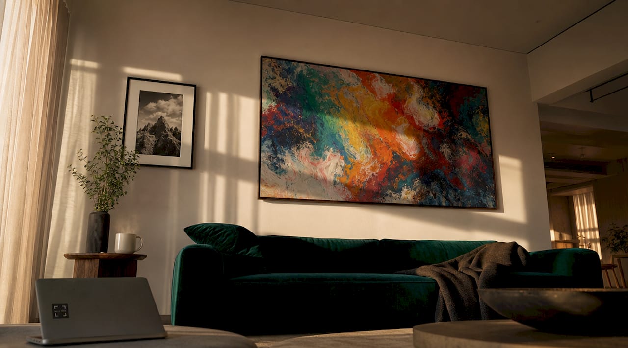
Landscape orientation does the opposite. It widens a wall visually and introduces a sense of calm, making it the natural fit for large living room walls, bedroom headboard walls, and open-plan spaces. A wide panoramic print above a sofa creates balance because the horizontal line of the artwork mirrors the horizontal line of the furniture below it.
- Portrait art adds vertical drama, suits narrow walls, and creates an elegant focal point above small furniture like console tables or accent chairs.
- Landscape art adds horizontal balance, suits wide walls, and reinforces the calm, grounded feeling of living rooms and bedrooms.
- Square formats act as a neutral bridge between the two and work well when you want visual weight without strong directional pull.
Pro Tip: Before buying, tape a piece of paper to your wall in the approximate dimensions of the artwork you are considering. Live with it for a day. The orientation that feels most natural in that space is almost always the right choice.
What are the size and placement rules for wall art?
Size is where most decorators go wrong, regardless of orientation. My Decorative recommends that artwork cover approximately 60 to 75% of the available wall space above furniture. This ratio applies whether you are hanging a portrait print above a narrow console or a landscape canvas above a king-size bed. Getting this proportion right makes the difference between art that anchors a room and art that floats awkwardly on the wall.
Kit Kemp’s design guidance reinforces this with a direct observation: oversized pieces anchor rooms far more effectively than prints that are too small and feel lost on the wall. Confidence in scale is more important than perfect symmetry. A single large landscape canvas above a sofa will almost always outperform three small prints arranged in a row.
Here is a practical framework for matching orientation to placement:
- Above a sofa or bed: Choose landscape orientation. The width of the furniture calls for a horizontal counterpart. Aim for a canvas that spans roughly two-thirds of the sofa’s width.
- Above a console or narrow sideboard: Choose portrait orientation. The vertical format mirrors the upright nature of the furniture and fills the wall height without spreading awkwardly.
- In a stairwell: Use portrait prints or a vertical gallery arrangement. The ascending line of the staircase pairs naturally with upward-moving art.
- On a large, uninterrupted wall: Landscape format or a wide gallery cluster works best. A single portrait print on a very wide wall will look isolated.
- In a hallway: Portrait orientation is the standard choice. Hallways are narrow by definition, and portrait art respects that geometry.
| Wall type | Recommended orientation | Ideal coverage |
|---|---|---|
| Wide living room wall | Landscape | 60 to 75% of wall width |
| Narrow hallway | Portrait | Full vertical emphasis |
| Above sofa | Landscape | Two-thirds of sofa width |
| Stairwell | Portrait or vertical gallery | Follows stair ascent |
| Above bed headboard | Landscape or square | Matches bed width |
Pro Tip: Check Artify’s size guide before ordering. It maps specific print dimensions to common furniture widths and wall heights, which removes the guesswork from the 60 to 75% rule.
How do art styles and themes align with each orientation?
Orientation and artistic style are not independent choices. The format you select shapes how the subject matter reads, and mismatching the two creates visual tension that most viewers notice even if they cannot name it.
Portrait orientation is the natural home for figure-focused artwork, classical portraiture, botanical studies, and any composition where a single subject demands full attention. The vertical frame concentrates focus and creates intimacy. Heirloom photography, for example, benefits from portrait orientation because symmetrical oval portrait arrangements lend elegance and balance, particularly on smaller gallery walls. The format signals that the subject matters.
Landscape orientation suits scenic compositions, abstract expanses, architectural photography, and any image where the story unfolds horizontally. A coastal photograph, a city skyline, or an abstract color field painting all gain power from the wide format because the viewer’s eye travels across the image rather than up and down it.
Framing choices amplify these effects. A thin, dark frame on a portrait print sharpens its vertical presence and adds formality. A wide, light-colored frame on a landscape print softens the edges and makes the image feel more immersive. Kit Kemp’s approach to art selection consistently pairs frame weight and color with the emotional tone of the artwork, treating the frame as part of the composition rather than a border around it.
- Contemporary interiors pair well with oversized landscape abstracts in neutral or muted tones, hung without frames or in thin metal frames.
- Traditional interiors benefit from portrait prints in ornate gilded or dark wood frames, especially figurative or botanical subjects.
- Eclectic interiors gain the most from mixing orientations deliberately, using portrait and landscape pieces of varying sizes to create a gallery wall with genuine visual energy.
What are the best room locations for each orientation?
Room function shapes orientation choice as much as wall size does. Portrait art for home use performs best in spaces where you want focus and formality: entryways that set a first impression, home offices where a single strong image anchors the desk wall, and dining rooms where a tall piece above a sideboard draws the eye without competing with the table setting.
Landscape wall decor tips consistently point to living rooms and bedrooms as the primary territory for wide-format art. The horizontal orientation mirrors the relaxed, horizontal posture of people sitting or lying down, which creates a subconscious sense of ease. Meghan Goering Photography’s gallery wall approach starts from wall dimensions and aligns artwork relative to furniture and architectural features, which is the correct sequence. You measure the wall first, then select the art.
Transitional spaces like open-plan living and dining areas benefit from mixing orientations. GalleryPlanner recommends alternating portrait and landscape frames within a gallery wall, including square formats, to create dynamic visual balance and prevent the monotony of a single orientation repeated across multiple pieces. This approach works especially well on long walls that connect two functional zones.
| Room | Best orientation | Reason |
|---|---|---|
| Entryway | Portrait | Creates immediate vertical focal point |
| Living room | Landscape | Mirrors horizontal furniture lines |
| Bedroom | Landscape or square | Promotes calm and balance |
| Home office | Portrait | Focuses attention, adds formality |
| Stairwell | Portrait or vertical gallery | Follows ascending sight line |
| Open-plan wall | Mixed gallery | Prevents monotony across long spans |
Lighting also factors into placement. Portrait art hung in a narrow hallway with a single overhead light benefits from a picture light mounted on the frame, which draws the eye upward and reinforces the vertical effect. Landscape art in a living room reads best under ambient or diffused lighting that spreads evenly across the full width of the piece.
Pro Tip: For gallery walls that mix orientations, GalleryPlanner advises including at least 4 distinct shot types or subjects across 6 pieces. Variety in content prevents the eye from getting bored even when the frames are uniform.
Key takeaways
Orientation is the single most consequential decision in wall art selection because it determines whether a piece adds height, width, or balance to a room.
| Point | Details |
|---|---|
| Portrait adds vertical energy | Use portrait orientation in narrow spaces, hallways, and above small furniture to draw the eye upward. |
| Landscape creates openness | Wide-format art suits large walls, sofas, and beds where horizontal balance reinforces calm. |
| Scale matters more than style | Art should cover 60 to 75% of available wall space above furniture for proper visual anchoring. |
| Mix orientations in galleries | Alternating portrait and landscape frames prevents monotony and creates dynamic visual storytelling. |
| Frame choice amplifies orientation | Thin dark frames sharpen portrait presence; wide light frames make landscape art feel immersive. |
What I have learned from watching people hang art wrong
Most people treat orientation as a secondary decision, something they figure out after they have already fallen in love with a print. At Artify, we see this play out constantly: a beautiful landscape photograph ordered for a narrow hallway, or a tall portrait canvas placed above a wide sectional sofa where it looks like a postage stamp on a billboard.
The uncomfortable truth is that the rules around orientation are not arbitrary. They are grounded in how human vision processes space. Your eye follows the longest dimension of an image. Portrait art makes a room feel taller. Landscape art makes it feel wider. Ignoring that when you choose art is like buying furniture without measuring the room first.
The other mistake I see regularly is treating orientation as fixed. A portrait print does not have to live in isolation. Mixing portrait and landscape orientations within a single gallery wall is one of the most effective ways to create a display that feels curated rather than collected. The contrast between vertical and horizontal pieces creates rhythm, and rhythm is what separates a gallery wall from a random arrangement of frames.
My honest recommendation: choose art that moves you first, as Kit Kemp puts it, then use orientation as the tool that makes it work in your specific space. Personal connection to the artwork is the foundation. Orientation is the architecture around it.
— Artify
Find your perfect orientation with Artify’s curated collections
Artify’s pre-made collections are organized by orientation, theme, and room type, so you can browse portrait and landscape options side by side without second-guessing scale or style compatibility. Every piece is produced by independent artists and printed to gallery quality, with framing options that complement both vertical and horizontal formats.
The platform’s 3D room preview tool lets you see exactly how a portrait or landscape print will look on your specific wall before you order. Artify’s how it works page walks you through the full process, from selecting dimensions to choosing frame finishes, so your first order arrives ready to hang. Whether you are filling a narrow hallway with portrait art or anchoring a living room wall with a wide landscape canvas, Artify has the print and the guidance to get it right.
FAQ
What is the difference between portrait and landscape wall art?
Portrait wall art is taller than it is wide, creating vertical emphasis and a sense of height. Landscape wall art is wider than it is tall, creating horizontal balance and a feeling of openness and depth.
Which orientation works best above a sofa?
Landscape orientation is the standard choice above a sofa because the horizontal format mirrors the width of the furniture below it. The artwork should span approximately two-thirds of the sofa’s width for proper visual balance.
Can you mix portrait and landscape prints in a gallery wall?
Mixing orientations in a gallery wall is not just acceptable. It is recommended. GalleryPlanner advises alternating portrait and landscape frames, including square formats, to create dynamic visual interest and prevent monotony across a multi-piece display.
How do I know what size art to buy for my wall?
Art should cover approximately 60 to 75% of the available wall space above furniture, according to My Decorative. Measure the width of your furniture first, then select a print that fills that proportion of the wall above it.
Does portrait art work in large rooms?
Portrait art works in large rooms when placed strategically, such as above a narrow console against a wide wall or as part of a mixed gallery arrangement. A single portrait print centered on a very large wall will feel isolated; pairing it with other pieces or using it as a vertical anchor within a cluster solves that problem.