

TL;DR:
- Premium wall art relies on high-quality materials, expert production, and proper framing to ensure long-lasting, gallery-quality displays. Choosing pigment-based inks, OBA-free substrates, and UV-protective framing significantly extends artwork longevity and visual impact. Proper display conditions, suitable sizing, and thoughtful composition are essential for maximizing aesthetic and preservation value.
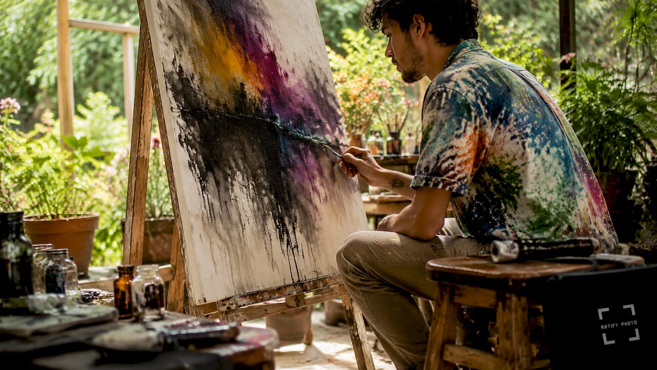
Premium wall art selection is the practice of choosing artworks defined by superior materials, expert production methods, and thoughtful curation to create a lasting, gallery-quality presence in your home. The difference between a piece that fades in three years and one that holds its color for a century comes down to substrate quality, ink chemistry, and finishing craft. This guide covers everything you need to know: from giclée printing and cotton canvas to framing profiles, display lighting, and composition rules. Brands like Hahnemühle and Breathing Color set the material standard, and understanding why puts you in control of every purchase.
What materials and printing processes define premium wall art?
The substrate is the foundation of any high-end wall print. Premium canvas substrates are typically cotton or cotton-poly blends with coated, OBA-free surfaces designed specifically for pigment inks. OBA stands for optical brightening agents. These additives cause yellowing over time, so their absence is a direct marker of archival intent.
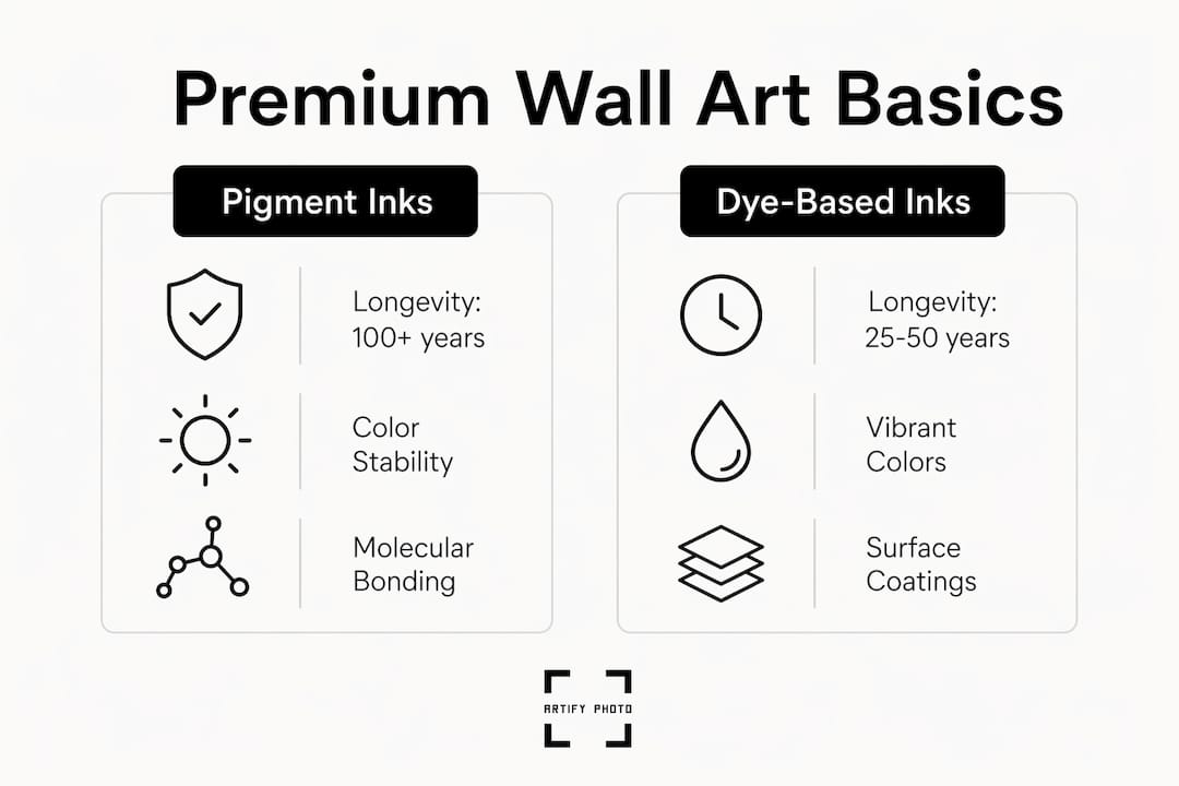
Ink chemistry matters just as much as the canvas. Pigment-based inks bond to the substrate at a molecular level, while dye-based inks sit on the surface and fade faster under light exposure. Giclée prints using pigment inks produced on museum-grade Epson SureColor printers with UltraChrome PRO inks show over 100 years of display life under typical conditions. That number is not a marketing claim. It comes from accelerated aging tests used by conservation labs.
The word “giclée” is the recognized industry term for fine art inkjet printing at high resolution. You will see it used interchangeably with “fine art print” across the premium market. When a vendor does not name their ink type or substrate, that omission is itself a red flag.
Here is a quick comparison of the two main ink types:
| Feature | Pigment Inks | Dye-Based Inks |
|---|---|---|
| Longevity (displayed) | 100+ years | 25–50 years |
| Fade resistance | High | Moderate |
| Color depth | Rich, stable | Vivid but unstable |
| Archival rating | Museum-grade | Consumer-grade |
| Best for | Fine art, luxury decor | Short-term prints |
Substrate coatings also affect the final finish. Matte coatings reduce glare and give a painterly texture. Gloss coatings intensify color saturation and work well for photography-based art. Satin sits between the two and is the most forgiving in mixed lighting environments.
Pro Tip: Ask any vendor to name their specific ink and substrate before purchasing. Brands like Hahnemühle and Breathing Color publish full technical specs. If a seller cannot tell you what paper or canvas they use, the product is almost certainly not premium.
For a broader breakdown of materials across different art formats, Artify’s types of wall art guide covers canvas, paper, metal, and acrylic options side by side.
How does expert framing and finishing enhance premium wall art?
Framing is where a technically excellent print either earns or loses its premium status. The details that separate gallery-quality finishing from mass-market output are mostly invisible in a small product thumbnail. They become obvious the moment you hang the piece on a wall.
Hand-stretched canvases on 1.5-inch wood stretcher bars create a tighter, more commanding profile than machine-stretched alternatives. The depth of the stretcher bar determines how the piece reads from across the room. A shallow 0.75-inch profile looks flat. A 1.5-inch gallery wrap commands the wall. Hand stretching with human inspection catches tension inconsistencies that automated processes miss entirely.
Staple placement is another detail worth examining. On a premium canvas, staples are placed on the back of the frame, not the sides. Side stapling is a cost-cutting shortcut that shows when the piece is viewed at an angle.
Here is how key finishing details compare across quality tiers:
| Finishing Detail | Premium Standard | Mass-Market Standard |
|---|---|---|
| Stretcher bar depth | 1.5 inches | 0.75 inches or less |
| Stretching method | Hand-stretched, inspected | Machine-stretched |
| Staple placement | Back of frame | Side of frame |
| Glazing option | UV-filtering glass or acrylic | Standard glass |
| Edge treatment | Gallery wrap or hand-painted | Folded or white border |
UV-filtering glazing is the single most impactful framing upgrade for paper-based prints. UV-protective glazing blocks the ultraviolet rays that cause pigment fading and paper deterioration. Museums use it as standard practice. For home collectors, it extends the life of a framed print significantly beyond what standard glass allows.
Pro Tip: When ordering framed prints, always request UV-filtering acrylic over standard glass. Acrylic is lighter, shatter-resistant, and optically clearer than most glass options at the same price point.
Artify’s framing selection guide walks through profile depths, material options, and finishing choices in detail.
How to choose wall art that fits your space and style
Scale is the most common mistake buyers make. A piece that looks substantial on a product page can disappear on a large wall, or overwhelm a small room. The rule of thumb used by interior designers is that art should cover roughly 60–75% of the wall width it occupies. For a sofa, the art above it should span at least two-thirds of the furniture’s width.
Composition is equally important. A 70/30 balance between a dominant focal element and supporting negative space creates lasting visual harmony. Pieces that fill every corner of the frame feel busy and tire the eye quickly. Negative space is not empty. It is what gives the subject room to breathe.
When matching art to a room’s style, consider these guidelines:
- Modern and minimalist rooms work best with abstract art, geometric forms, or high-contrast black-and-white photography. Clean lines in the art reinforce clean lines in the furniture.
- Traditional and classic interiors suit figurative work, landscapes, and botanical prints in warm tones. Ornate frames complement rather than compete with detailed art.
- Eclectic and bohemian spaces can carry bold color, mixed media, and layered gallery walls. The key is a consistent color palette across pieces.
- Industrial and loft-style rooms pair well with large-format photography, urban art, and raw-edge canvas wraps without frames.
Orientation matters more than most buyers realize. Portrait orientation draws the eye upward and makes ceilings feel higher. Landscape orientation widens a space visually and works well in low-ceilinged rooms or above long furniture runs. For a single statement piece, landscape almost always reads as more confident on a wall.
For current style directions, Artify’s 2026 wall art trends guide covers the formats and aesthetics gaining traction this year. The Ago Studio resource on gallery wall design is also worth reviewing if you are deciding between a single statement piece and a grouped arrangement.
Best practices for displaying and preserving premium wall art
Light is the primary threat to any displayed artwork. The cumulative effect of light exposure over years matters more than any single material choice. Museums maintain art lighting at 50–100 lux and strictly limit UV exposure to extend print life well beyond 100 years. That is a practical benchmark for home display too.
Follow these steps to protect your investment:
- Avoid direct sunlight. Position art away from windows that receive direct afternoon sun. Even UV-filtered glass does not block all light energy.
- Use warm LED lighting. LED picture lights or track lighting at 2700–3000K color temperature render art accurately without generating heat or UV radiation.
- Keep lighting levels moderate. Aim for 50–100 lux at the art surface. A simple lux meter app on your phone gives a reliable reading.
- Control humidity and temperature. Ideal conditions are 45–55% relative humidity and 65–70°F. Fluctuations cause canvas to expand and contract, weakening adhesion over time.
- Rotate displayed pieces periodically. If you own multiple works, rotating them reduces cumulative light exposure on any single piece.
For pieces not on display, archival storage in cool, dry, dark environments can extend print life to over 300 years. Dark storage removes the light variable entirely. This is how major collections preserve works between exhibitions.
Common mistakes to avoid when selecting premium wall art
Most buyers focus on the image and ignore the production details. That is the root cause of nearly every disappointing purchase in the luxury wall decor category.
- Skipping material verification. Mass-produced canvases from big-box retailers compromise longevity and archival quality. Always ask for ink type, substrate name, and print resolution before buying.
- Choosing the wrong size. Measure your wall and calculate the recommended coverage before ordering. A piece that is too small reads as an afterthought.
- Ignoring the frame profile. A shallow frame on a large canvas looks cheap regardless of print quality. Match frame depth to canvas size.
- Neglecting environmental factors. Hanging art above a fireplace, radiator, or in a bathroom exposes it to heat and humidity that accelerate deterioration.
- Prioritizing price over provenance. Exclusive artwork options from independent artists or specialist print studios cost more for a reason. The difference shows over years, not weeks.
Key takeaways
The quality of a premium wall art selection is determined by substrate chemistry, ink longevity, hand finishing, and display conditions working together.
| Point | Details |
|---|---|
| Substrate and ink define longevity | Choose OBA-free cotton canvas with pigment inks for prints that last 100+ years. |
| Hand finishing signals quality | Hand-stretched canvases on 1.5-inch bars outperform machine-stretched alternatives visually and structurally. |
| UV protection is non-negotiable | UV-filtering glazing and controlled lighting at 50–100 lux preserve color fidelity over decades. |
| Scale and composition drive impact | Art should cover 60–75% of wall width; a 70/30 focal balance prevents visual fatigue. |
| Verify before you buy | Ask vendors to name their ink and substrate; silence on those details means the product is not premium. |
Why material quality is the only metric that actually matters
At Artify, we have seen every version of this conversation. A buyer falls in love with an image, orders it from a generic print shop, and within two years the colors have shifted and the canvas has warped. The image was never the problem. The production was.
The uncomfortable truth about luxury wall decor is that the image is almost secondary. A mediocre photograph printed on Hahnemühle Photo Rag with UltraChrome PRO inks will outlast and outshine a stunning image printed on dye-ink consumer stock. Materials are not a detail. They are the product.
What we have also found is that stretch and profile details invisible in small thumbnails critically affect how artwork reads at a distance. A 1.5-inch gallery wrap on a large canvas does not just look better up close. It commands the room from the doorway. That is the difference between art that decorates and art that defines a space.
Our honest advice: treat your wall as a lighting and framing system first, and a display surface second. The best premium art pieces we have seen ruined were not damaged by poor printing. They were damaged by direct sun, radiator heat, and bathroom humidity. Protect the environment before you invest in the piece.
— Artify
Explore artify’s curated premium collections
Artify brings together independent artists and museum-grade production in one place. Every piece in the pre-made collections is produced on archival-quality substrates with pigment inks, hand-finished, and available with UV-filtering frame options. You are not choosing between quality and personality. You get both.
Whether you want a ready-to-hang statement piece or a fully custom print built from your own photograph, Artify’s how it works page walks you through every step. The 3D room preview tool lets you see exactly how a piece reads on your specific wall before you commit. Browse the collections and find the piece your space has been waiting for.
FAQ
What makes a wall art print truly museum-grade?
Museum-grade prints use pigment-based inks on OBA-free cotton or cotton-poly substrates, producing display lifespans of over 100 years under proper conditions. Vendors who qualify as museum-grade name their specific ink system and substrate openly.
How long do giclée prints last compared to standard prints?
Giclée prints with pigment inks last over 100 years when displayed correctly and over 300 years in archival dark storage. Standard dye-ink prints typically last 25–50 years under the same display conditions.
What is the right lighting level for displaying premium wall art?
Museums display art at 50–100 lux with UV-filtered lighting. At home, warm LED picture lights at 2700–3000K color temperature replicate those conditions closely without generating damaging heat.
How do i choose the right size art for my wall?
Art should cover roughly 60–75% of the wall width it occupies. Above a sofa, the piece should span at least two-thirds of the furniture’s width to read as intentional rather than incidental.
Is hand-stretched canvas worth the premium price?
Hand-stretched canvas on 1.5-inch stretcher bars creates tighter tension, better profile depth, and a more commanding wall presence than machine-stretched alternatives. Human inspection during stretching also catches quality inconsistencies that automated processes miss.