


TL;DR:
- Choosing art requires a multi-stage approach focused on emotional connection, practical criteria, and thoughtful placement. Homeowners should prepare by measuring room dimensions, analyzing lighting, and clarifying the desired mood before selecting artwork. Avoid impulsive purchases by testing scale, observing art in the space, and respecting blank wall space for a balanced and intentional collection.
The art selection process is the methodical approach to choosing artwork that resonates emotionally, fits your space, and elevates your home’s atmosphere. Most homeowners treat it as a single decision. The ones who get it right treat it as a multi-stage practice, moving from self-assessment through sourcing, placement, and long-term curation. Kit Kemp puts it plainly: choose pieces that move you and you cannot stop looking at. That principle, combined with practical criteria around scale, light, and material, is what separates a room that feels alive from one that just has art on the walls.
How to prepare your space and mindset before choosing artwork
Preparation is the step most homeowners skip, and it is the reason so many purchases end up in storage. Before you look at a single piece, you need to understand the room you are buying for.

Start with the room’s function and dimensions. A home office calls for focused, calming work. A living room invites conversation and warmth. Analyzing room usage before selecting art shapes every decision that follows, from scale to subject matter. Measure your walls, note ceiling height, and identify the anchor wall where art will carry the most visual weight.
Lighting changes everything. Natural north-facing light reads cool and blue. South-facing rooms run warm and bright. Artificial lighting, especially incandescent or warm LED, shifts color perception significantly. Hold a color swatch or a printed image in the room at different times of day before committing to a palette. What looks rich and moody in a showroom can look flat under your kitchen’s overhead lights.
Know your emotional starting point. Ask yourself what feeling you want the room to produce. Calm? Energy? Nostalgia? Your answer narrows the field faster than any style guide. Art’s role in personalization is not decorative. It is psychological. The pieces you live with daily shape your mood and your sense of home.
Pro Tip: Photograph your room in both morning and evening light, then lay those photos side by side. The color shift between the two shots tells you exactly what tones will hold up across the day.
- Measure the primary wall and note the furniture footprint below it
- Identify light sources: natural direction, artificial type, and intensity
- Write down three words that describe how you want the room to feel
- Note any existing fixed colors: flooring, cabinetry, upholstery
What criteria should guide your art selection?
Concrete art selection criteria prevent impulse buys and buyer’s regret. The following factors form a working art selection checklist you can apply to any piece before purchasing.
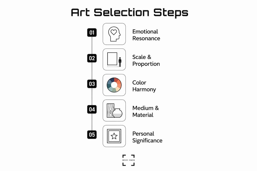
Emotional resonance
Emotional resonance is the single most important factor in choosing artwork. It outweighs price, trend, and matching decor. If a piece does not hold your attention after thirty seconds, it will not hold it after thirty days on your wall. Personal significance, whether a subject, a memory, or a feeling, creates lasting satisfaction that investment value rarely does.
Scale and proportion
Art that is too small reads as an afterthought. Art that is too large overwhelms the room. The standard rule: choose pieces two-thirds to three-quarters the width of the furniture below them. A sofa that is 84 inches wide calls for artwork in the 56–63 inch range. When a single piece at that scale is not available or affordable, a gallery wall of smaller works achieves the same visual mass.
Color harmony, not color matching
Martha Stewart’s design team draws a clear line between harmony and matching. Harmony means pulling one or two tones from the room’s existing palette and letting the artwork introduce contrast. Matching means replicating the exact color of your sofa cushions in your art, which produces interiors that feel flat and uninspired. The goal is a shared tonal language, not a uniform.
Understanding vibrant color printing helps here. Printed art reproduces color differently depending on the process, and knowing how pigment behaves on paper versus canvas helps you predict how a piece will read in your specific light conditions.
Medium and material
Oil and acrylic paints differ in texture, color depth, and care requirements. Understanding the medium helps you make a confident choice and avoid mismatches between the artwork and its environment. High-traffic areas like hallways and kitchens need durable materials. Canvas and acrylic prints hold up well. Delicate watercolors and charcoal works belong in lower-traffic spaces where they will not be bumped or exposed to humidity.
Storytelling and personal significance
Art that tells a story gives you something new every time you look at it. A landscape from a place you love, a portrait that captures a personality, or an abstract that mirrors a feeling you cannot name. These pieces age well. Generic decorative art, chosen purely to fill a wall, rarely does.
| Selection criterion | What to check |
|---|---|
| Emotional resonance | Does the piece hold your attention after 30 seconds? |
| Scale | Is the width two-thirds to three-quarters of the furniture below? |
| Color harmony | Does it share one or two tones with the room without replicating them exactly? |
| Medium suitability | Is the material appropriate for the room’s traffic and humidity level? |
| Personal significance | Does the piece connect to a memory, place, or feeling that matters to you? |
How do you source, select, and place art in your home?
The sourcing stage is where most homeowners either find something they love or settle for something convenient. Both outcomes are avoidable with a clear process.
-
Explore multiple sources before deciding. Galleries, local art markets, online platforms, and independent artist shops each offer different price points and styles. Comparing art marketplaces before committing gives you a realistic sense of what is available at your budget. Do not buy from the first source you visit.
-
Test scale before you hang anything. Tape a paper template to the wall at the exact dimensions of the piece you are considering. Live with it for two or three days. This physical scale test helps visualize placement before you commit money or nail holes to the wall.
-
Prop art before hanging it. Living with art temporarily before hanging it reveals whether it truly belongs in the space. Lean a piece against the wall and observe it during your normal daily routine. If you stop noticing it within a week, it is not the right piece.
-
Hang at the right height. The standard is eye level at 57–60 inches from the floor to the center of the artwork. This applies whether the piece hangs alone or as part of a gallery wall. Hanging too high is the most common placement error in residential spaces.
-
Respect blank space. Blank wall space is a compositional tool, not wasted real estate. It gives the eye a place to rest and draws attention to the art itself. Filling every wall removes that breathing room and makes a space feel cluttered rather than curated.
-
Balance art within the room layout. A large piece on one wall needs visual counterweights elsewhere, whether through furniture mass, a mirror, or a smaller grouping. Art does not exist in isolation. It reads in relation to everything around it.
Pro Tip: For gallery walls, lay all the pieces on the floor first and arrange them until the grouping feels balanced. Photograph the layout, then transfer it to the wall using that photo as your guide. This saves hours of repositioning.
What mistakes should you avoid during the art purchase process?
Knowing what not to do is as useful as knowing what to do. These are the most common errors homeowners make during the art purchase process.
-
Matching art too literally to decor. Avoiding exact color matching is one of the clearest rules in art curation guidelines. When art mirrors the exact color of your cushions or rug, both the art and the decor lose their individuality. Aim for shared tones, not identical ones.
-
Choosing art that is too small. Undersized art on a large wall reads as timid. If a single piece at the right scale is out of budget, a gallery wall of smaller pieces achieves the same visual impact with more flexibility.
-
Ignoring light damage. Works on paper and photography fade when exposed to direct sunlight. UV-protective glazing or careful placement away from windows extends the life of delicate pieces significantly. This is one of the most overlooked practical considerations in the art selection process.
-
Buying impulsively without testing. A piece that thrills you in a gallery may feel wrong in your home. The prop-and-observe method described above costs nothing and prevents expensive regret.
-
Neglecting framing. Proper framing choices, including UV-protective glass for sensitive works, extend the life of the artwork and affect how it reads in the room. A strong piece in a weak frame loses half its impact.
How do you curate and evolve your home art collection over time?
Art curation is not a one-time event. Art should evolve with your identity and your home, which means the collection you build at 30 will look different at 45. That is not a failure of taste. It is evidence of a living collection.
A practical approach to curating art for your home starts with an anchor: one artist, one medium, or one theme that gives the collection a spine. Everything else can vary in style, scale, and period as long as it relates back to that anchor.
- Curate for identity, not trends. Trend-driven purchases date quickly. Art chosen for personal meaning holds its relevance regardless of what is popular in a given year.
- Mix high and low. Combining established artists with younger or more personal objects adds depth and character. A framed print from an independent artist alongside a vintage market find tells a more interesting story than a matched set from a single source.
- Rearrange before you replace. Moving art between rooms often solves the problem of a piece that has stopped working in its current location. A painting that feels wrong in the bedroom may be exactly right in the hallway.
- Build gradually. Resist the urge to fill every wall at once. A collection built over years, one considered piece at a time, always reads as more intentional than a room furnished in a single shopping session.
Key Takeaways
The most effective art selection process combines emotional resonance with practical criteria, including scale, color harmony, material suitability, and thoughtful placement.
| Point | Details |
|---|---|
| Emotional resonance first | Choose art that holds your attention after 30 seconds. It will hold it for years. |
| Scale the two-thirds rule | Art above furniture should be two-thirds to three-quarters the width of that furniture. |
| Harmony over matching | Pull one or two tones from the room; let the art introduce contrast, not uniformity. |
| Test before you hang | Prop art against the wall and observe it for several days before committing. |
| Curate over time | Build your collection gradually around an anchor theme, not a single shopping trip. |
What I have learned from years of helping people choose art
The advice I see repeated most often is “buy what you love.” That is true, but it is incomplete. Loving a piece in a gallery and living with it daily are two different experiences. The homeowners who end up most satisfied are the ones who slow down. They tape paper templates to the wall. They prop pieces and walk past them for a week. They resist the pull of a perfectly coordinated room and choose something that surprises them instead.
The other thing I have noticed: people consistently underestimate the power of blank space. There is a reflexive urge to fill walls, as if empty space signals an unfinished home. The opposite is true. A single strong piece on a large wall, with room to breathe around it, commands more attention than five pieces competing for the same space.
Trust your instincts, but test them. The art that makes you pause in a gallery is worth investigating. The art that makes you pause every morning in your own home is worth keeping.
— Artify
How Artify makes choosing artwork easier
Selecting art with confidence gets easier when you can see how a piece actually looks in your space before you buy it.
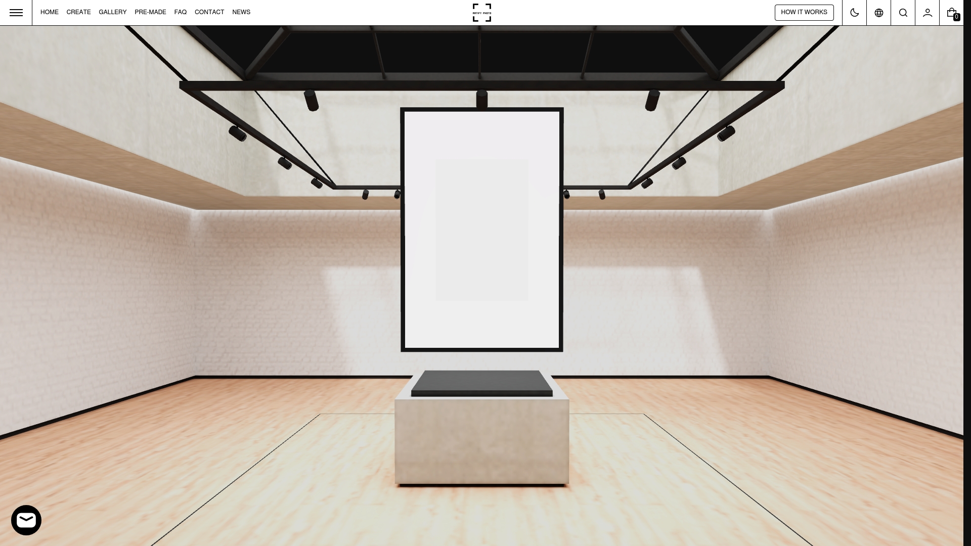
Artify’s pre-made collections are curated around themes, color palettes, and styles that work in residential spaces, so you are not starting from a blank search. Each collection is built with harmony in mind, which means the hard work of pairing tones and scales is already done. Artify also offers 3D room previews and personalized framing options, so you can test how a piece reads in your specific room before it ships. For homeowners who want art that reflects their own photographs and memories, Artify’s custom print service turns personal images into gallery-quality wall art made by independent artists.
FAQ
What is the art selection process?
The art selection process is a structured approach to choosing artwork that fits your space emotionally, visually, and practically. It covers everything from assessing room dimensions and lighting to sourcing, testing, and placing art.
How do I know what size art to buy?
A reliable rule is to choose artwork that is two-thirds to three-quarters the width of the furniture below it. For a sofa that is 84 inches wide, that means artwork in the 56–63 inch range.
Should art match my room’s color scheme?
Art should harmonize with your room’s colors, not replicate them exactly. Pull one or two tones from the existing palette and let the artwork introduce contrast. Exact matching produces flat, uninspired interiors.
How do I avoid buying art I will regret?
Prop the piece against the wall and observe it during your normal daily routine for several days before hanging it. If it still holds your attention after a week, it belongs in the space.
What materials work best in high-traffic areas?
Canvas and acrylic prints hold up well in hallways, kitchens, and other busy spaces. Delicate materials like watercolor on paper or charcoal work best in lower-traffic rooms away from direct sunlight and humidity.