

TL;DR:
- Wall art is a key structural element in interior design, shaping room atmosphere, proportion, and personal identity. Proper integration from the start ensures cohesive furniture, color, and lighting choices, creating spaces that feel curated rather than assembled. In bedrooms and small spaces, selection strategies focus on calming tones, vertical compositions, and impactful single pieces to enhance relaxation and perceived room size.
Wall art is defined as any decorative or expressive work displayed on a wall that shapes the mood, identity, and spatial character of a room. The role of wall art in interior design goes far beyond filling empty space. A well-chosen piece sets the color palette, anchors the furniture arrangement, and tells visitors who lives there. This guide covers how art functions as a structural element, its emotional effects by room type, the practical rules for sizing and placement, and how to tailor your choices for bedrooms and compact spaces.
How does wall art function as a structural element in interior design?
Wall art is a structural design element, not a finishing touch. Designers Polo and Onuska advise integrating art from the very beginning of the design process so it actively shapes room atmosphere and spatial flow. When art comes first, it informs furniture scale, lighting placement, and color decisions. When it arrives last, it often fights everything already in the room.
Think about an open-concept living area. A large-format canvas placed before the sofa is chosen creates a visual anchor that the rest of the furniture responds to. The rug color, the throw pillow tones, even the lamp finish can all reference the painting. That kind of cohesion is nearly impossible to achieve when art is selected after every other decision is locked in.
“Art should not decorate a room. It should define it.” This principle, shared by leading interior designers, captures why early art integration produces spaces that feel curated rather than assembled.
Transitional spaces deserve the same attention. Hallways, bathrooms, and home offices are often overlooked, but they carry real potential to add character. A single framed print in a narrow hallway can transform a forgotten corridor into a moment of personality.
Pro Tip: Before buying a single piece of furniture for a new room, identify one or two artworks you love. Let those pieces drive your palette and proportion decisions from the start.
What are the emotional and psychological effects of wall art in different rooms?
Art directly controls the emotional atmosphere of a room. Themes and colors in wall art impact stress levels, creativity, and social energy in measurable ways. Nature scenes, muted palettes, and abstract works with smooth textures promote serenity. Bold geometric prints and saturated colors stimulate energy and conversation.
The effect shifts depending on the room’s purpose:
- Living rooms benefit from statement pieces that spark conversation. A large abstract in warm ochres and terracotta signals warmth and social openness.
- Bedrooms call for calm tones and quieter compositions. Soft blues, sage greens, and organic forms lower visual noise and support rest.
- Home offices respond well to art that inspires focus. Architectural photography, typographic prints, and monochromatic works keep the mind engaged without distraction.
- Dining rooms can carry more drama. Deep jewel tones and figurative work create a sense of occasion around shared meals.
Color psychology in art is not abstract theory. Warm tones like red, amber, and gold raise perceived room temperature and energy. Cool tones like blue, gray, and sage do the opposite. Choosing art with this in mind is one of the fastest ways to shift how a room feels without touching a single piece of furniture.
Art also expresses cultural identity and personal values. A collection of prints by independent artists, a photograph from a meaningful trip, or a piece commissioned from a local painter all communicate something specific about the person who lives there. That layer of meaning is what separates a home from a showroom. Explore art and personal identity to understand how this works in practice.

What are the best practices for choosing and placing wall art?
Placement and sizing are where most homeowners make costly mistakes. The rules below are grounded in professional practice and apply to nearly every room.
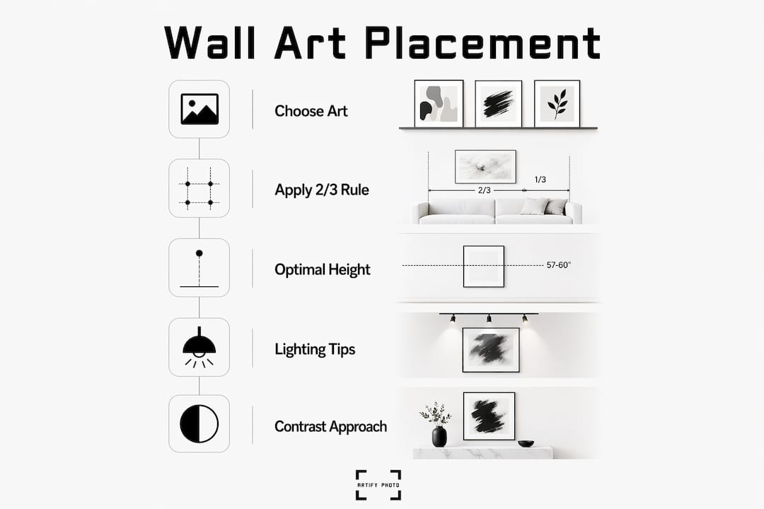
Sizing: the 2/3 rule
The 2/3 rule states that wall art width should equal roughly two-thirds the width of the furniture or wall section it relates to. A sofa that is 84 inches wide calls for artwork in the 56-inch range. This proportion creates visual balance and prevents the floating, disconnected look that comes from hanging a small piece above a large piece of furniture.
Hanging height
Professional standards center artwork at 57–60 inches from the floor. This places the visual midpoint of the piece at average eye level. Galleries worldwide use this standard because it works across nearly all body heights and room scales. The most common mistake homeowners make is hanging art too high, which disconnects it from the furniture below.
Groupings vs. statement pieces
- Large statement pieces work best in open-concept rooms or above a primary furniture anchor like a sofa or bed. They expand visual boundaries and create a clear focal point.
- Grouped smaller works build intimacy and allow you to tell a layered story. A gallery wall of five to seven pieces in a dining room or stairwell creates warmth and visual interest without requiring a single large-format print.
- Diptychs and triptychs offer a middle path. They read as one cohesive work from a distance but introduce movement and rhythm up close.
Pro Tip: Before putting a single nail in the wall, lay your intended arrangement on the floor. Photograph it from standing height. That photo shows you exactly how the grouping will read on the wall.
Contrast over matching
Treating art as a color match for existing furniture is the most common mistake in residential design. Art that perfectly mirrors the sofa color or the rug pattern produces a flat, showroom result. Effective art introduces tension. A cool-toned abstract in a warm, wood-heavy room creates the kind of visual interest that makes a space feel considered rather than coordinated.
Lighting
Warm, adjustable lighting shows art textures and colors at their best. Dimmable overhead fixtures combined with directed picture lighting create depth and highlight the work without harsh glare. Track lighting with adjustable heads gives you flexibility as your collection grows. For a deeper look at framing and display choices, the framed art selection guide covers the full process.
How does wall art vary in bedrooms and small spaces?
The role of wall art in bedrooms is fundamentally different from its role in social spaces. Bedrooms are sanctuaries. The art you choose there should support calm and rest, not compete for attention.
Bedroom art works best when it belongs to the same visual family as the room’s furnishings without exactly matching them. A linen-toned duvet and warm wood nightstands pair naturally with a soft watercolor landscape or a muted abstract in sand and blush. The connection is tonal, not literal. That distinction matters because forced matches look artificial, while tonal harmony feels effortless.
For small spaces, the role of wall art shifts again:
- Vertical compositions draw the eye upward and make ceilings feel higher.
- Light-toned works on light walls expand perceived depth.
- Multi-panel artworks introduce movement and scale without the visual weight of a single large canvas.
- Minimalist prints with generous white space prevent a compact room from feeling cluttered.
- Mirrors framed as art reflect light and double the perceived width of a narrow room.
One underused strategy in small spaces is the single oversized piece. Counterintuitively, one large work often reads better in a small room than several small ones. Multiple small frames create visual fragmentation. A single confident piece gives the eye one place to land and makes the room feel more deliberate. For room-specific guidance, the room-by-room art guide breaks this down in detail.
Key takeaways
Wall art is a structural design element that shapes mood, proportion, and personal identity in every room of a home.
| Point | Details |
|---|---|
| Integrate art early | Choose key artworks before finalizing furniture and color decisions to build real cohesion. |
| Follow the 2/3 rule | Art width should equal roughly two-thirds the width of related furniture for balanced proportion. |
| Hang at eye level | Center artwork at 57–60 inches from the floor to match professional gallery standards. |
| Contrast beats matching | Art that introduces visual tension creates more interest than pieces that mirror existing colors. |
| Adapt art to the room | Bedrooms need calm tones and tonal harmony; small spaces benefit from vertical or oversized single works. |
Artify’s take on why art belongs at the start, not the end
Most homeowners treat wall art as the last item on the shopping list. That single habit is responsible for more design disappointments than any other decision. I have seen beautifully furnished rooms that feel completely lifeless because the art was chosen in a hurry after everything else was already in place. The pieces look like they were added to fill space, because they were.
The rooms that genuinely move people are the ones where the art came first, or at least early. The furniture responds to it. The lighting serves it. The color palette echoes it. That sequence is not complicated, but it requires treating art as a design decision rather than a decorative purchase.
The other lesson I keep coming back to is the danger of playing it safe. Art that matches your sofa is not art. It is upholstery for your wall. The pieces that make a home feel alive are the ones that introduce something unexpected. A bold abstract in a quiet bedroom. A raw, textured print in a polished living room. That friction is what makes a space feel like someone actually lives there and has a point of view.
Choosing art that expresses who you are, rather than what coordinates with your furniture, is the single most effective upgrade you can make to any interior. It costs no more. It just requires a little more courage.
— Artify
Find art that fits your space from Artify’s curated collections
Knowing the principles is one thing. Finding the right piece is another. Artify’s pre-made collections bring together gallery-quality prints across a wide range of styles, from calm minimalist works suited to bedrooms to bold statement pieces built for living rooms and open-concept spaces.
Every piece in the collection is produced on demand by independent artists, so you are not choosing from generic stock. You are selecting work that carries real creative intent. Artify also offers 3D room previews so you can see exactly how a piece reads in your space before you commit. If you want something more personal, the custom art creation process lets you turn your own photographs into gallery-ready prints.
FAQ
What is the standard height for hanging wall art?
The professional standard centers artwork at 57–60 inches from the floor, placing the visual midpoint at average eye level. This is the same standard used by galleries worldwide.
How do I choose the right size art for my wall?
Apply the 2/3 rule: art width should equal roughly two-thirds the width of the furniture or wall section it relates to. This proportion prevents the floating, disconnected look that comes from undersized pieces.
What kind of art works best in a bedroom?
Bedroom art should use calm tones, nature scenes, or abstract works with smooth textures to support rest and reduce visual noise. The piece should belong to the same tonal family as the room’s furnishings without exactly matching them.
Does wall art really affect mood?
Yes. Color and theme in wall art directly influence emotional atmosphere. Cool tones lower perceived energy and promote calm, while warm tones and bold compositions raise energy and stimulate social interaction.
How should I display art in a small room?
Use vertical compositions to raise perceived ceiling height, choose light-toned works to expand depth, and consider a single oversized piece rather than multiple small frames. Multi-panel works add scale without the visual weight of one large canvas.