

TL;DR:
- Abstract wall art uses color, shape, line, texture, and composition to evoke meaning without depicting recognizable objects. Its formal elements create visual hierarchy and rhythm that influence room atmosphere more than imagery. Proper selection relies on scale, color, and composition to enhance modern interiors effortlessly.
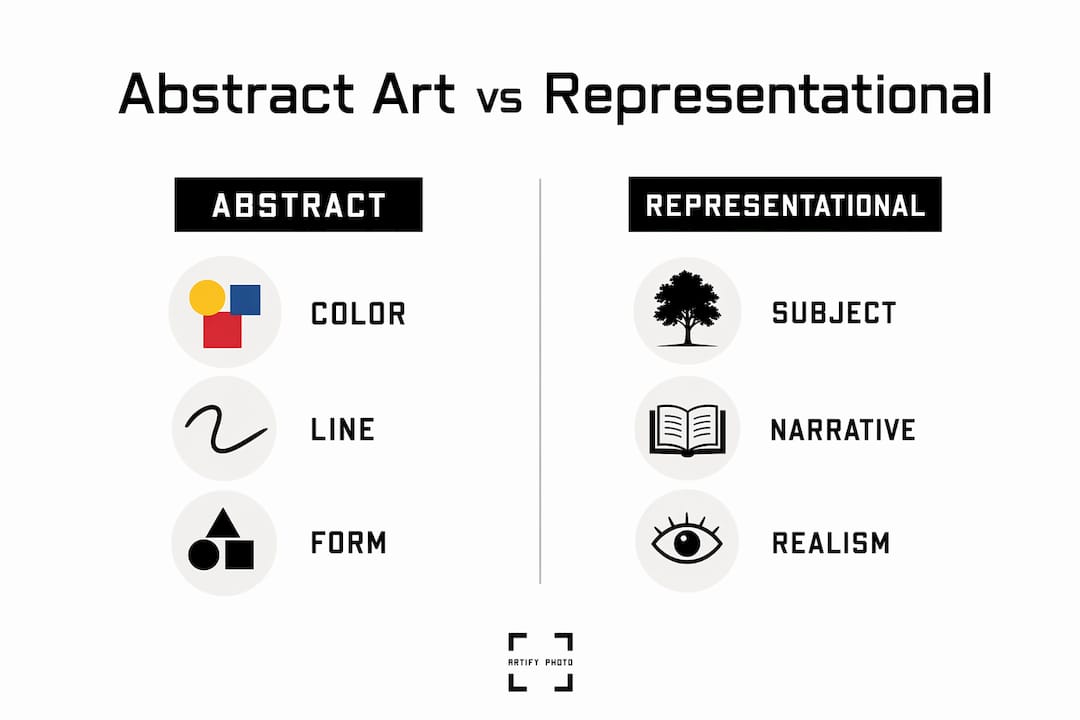
Abstract wall art is defined as artwork that uses color, shape, line, texture, and composition to create meaning without primarily depicting recognizable objects or scenes. Unlike a landscape painting or a portrait, abstract art communicates through visual relationships rather than literal imagery. That distinction matters more than most decorators realize. Understanding what makes art abstract changes how you shop for it, how you hang it, and how it makes a room feel.
What is abstract wall art and how does it differ from other styles?
Abstract wall art exists on a continuum from representational to fully nonrepresentational. At one end, you have a realistic oil painting of a bowl of fruit. At the other, you have a canvas of pure geometric shapes with no reference to the physical world at all. Most abstract wall art sold for home decor falls somewhere in the middle.

The term “abstract” covers a wide range. Semi-abstract works simplify or distort real subjects. A painting of a forest might reduce the trees to vertical color blocks. A portrait might dissolve into gestural brushstrokes. These pieces still carry a reference to reality, but that reference is secondary to the visual experience. Fully nonrepresentational art, sometimes called non-objective art, removes that reference entirely.
Abstract art communicates through formal relationships instead of literal narratives. Color sits against color. Line plays against interval. Shape creates tension with negative space. The viewer reads these relationships rather than identifying subjects. That is a fundamentally different kind of looking, and it is the core of what makes abstract art distinct.
The table below shows how abstract wall art compares to other major art categories across key characteristics.
| Category | Subject matter | Primary communication tool | Common decor use |
|---|---|---|---|
| Representational | Recognizable objects, scenes | Depicted imagery | Portraits, landscapes |
| Semi-abstract | Distorted or simplified subjects | Visual elements + imagery | Botanical prints, figure art |
| Abstract | Reduced or absent subjects | Color, line, form, composition | Modern and contemporary interiors |
| Nonrepresentational | No real-world reference | Pure visual elements | Minimalist and gallery-style spaces |
Understanding this spectrum prevents a common mistake: assuming all abstract art is the same. A softly blurred floral print and a hard-edged geometric canvas are both abstract, but they create entirely different atmospheres in a room.
What formal elements make abstract wall art work?
Strong abstraction is not random decoration. Effective abstract wall art is built with deliberate compositional structure: hierarchy, pacing, rhythm, and controlled imbalance. These elements organize where your eye travels and what you feel when you look at the piece.
The core formal elements in abstract wall art include:
- Color relationships. Two colors placed side by side create tension, harmony, or contrast. Warm colors advance visually; cool colors recede. A skilled abstract artist uses this to control depth and mood.
- Line and interval. A single bold line carries weight. The space between lines creates rhythm. Abstract works use this interplay to guide the eye across the canvas.
- Shape and form. Geometric shapes feel ordered and stable. Organic forms feel fluid and natural. The choice between them sets the emotional register of the piece.
- Negative space. The empty areas in an abstract composition are as deliberate as the marks. Negative space creates breathing room and prevents visual overload.
- Texture. Physical or implied texture adds tactile interest. Thick impasto paint, smooth gradients, and layered washes each communicate differently.
- Compositional hierarchy. Every strong abstract piece has a focal point. The eye needs somewhere to land before it moves through the rest of the composition.
Pro Tip: When evaluating an abstract piece, cover half of it with your hand. If the remaining half still feels complete and balanced, the composition has strong internal hierarchy. That is a reliable sign of quality.
Abstraction shifts the viewer’s focus from identifying objects to reading visual organization. This is why two people can stand in front of the same abstract painting and have completely different emotional responses. The composition creates a framework; personal perception fills in the meaning.
What are the popular styles of abstract wall art?
Abstract wall art styles vary widely, and each one creates a distinct mood in a living space. Knowing the major categories helps you match a piece to your room’s personality rather than just its color palette.
-
Geometric abstraction. This style uses precise shapes: circles, triangles, grids, and rectangles arranged in deliberate patterns. Artists like Wassily Kandinsky and Piet Mondrian pioneered this approach. Geometric abstract art feels ordered and modern. It works well in offices, kitchens, and contemporary living rooms where clean lines already dominate.
-
Abstract expressionism. This style prioritizes emotional spontaneity over structure. Think large gestural brushstrokes, dripped paint, and bold color fields. Artists like Mark Rothko and Jackson Pollock defined the movement. In a home, abstract expressionist pieces create energy and warmth. They suit living rooms and dining areas where you want the art to anchor the space.
-
Lyrical abstraction. A softer counterpart to abstract expressionism, lyrical abstraction uses flowing forms, muted palettes, and organic shapes. The result feels calm and contemplative. Bedrooms and reading nooks benefit most from this style.
-
Color field painting. Large areas of flat, solid color define this style. The focus is entirely on how colors interact across a wide surface. Color field works are ideal for minimalist interiors where a single bold statement is the goal.
-
Semi-abstract and simplified imagery. Most decor abstract works fall into this category. A simplified botanical, a loosely rendered cityscape, or a gestural figure all qualify. These pieces are accessible entry points for decorators who want the visual interest of abstraction without fully leaving representational art behind.
Staying current with abstract art trends helps you find styles that feel fresh rather than dated. The most popular abstract wall art designs in 2026 lean toward organic forms, earthy palettes, and textured surfaces that complement natural material interiors.
How to choose abstract wall art for your home
Choosing abstract art for home decor depends more on compositional coherence than on whether you personally “understand” the piece. Scale, color choice, framing, and negative space are the four factors that determine whether a piece enhances a room or fights with it.
Here is how to apply each factor:
- Scale and proportion. A small canvas on a large wall disappears. A piece that is too large overwhelms the furniture beneath it. The standard rule is to fill 60–75% of the wall width above a sofa or bed. For a gallery wall, treat the entire arrangement as one unit and apply the same proportion.
- Color alignment. Abstract art does not need to match your decor exactly. It needs to share at least one color with the room. Pull a secondary color from your rug, cushions, or curtains and look for abstract pieces that feature it prominently.
- Compositional hierarchy. Pieces lacking compositional hierarchy feel like surface patterns rather than art. Before buying, step back and ask where your eye lands first. If it wanders without settling, the piece lacks the structure to hold attention in a room.
- Negative space around the piece. Leave at least 6–8 inches of wall space on each side of a framed work. Crowding art against furniture or other frames reduces its visual impact.
- Framing and finish. A float frame suits bold, graphic abstract works. A simple black or natural wood frame suits organic and lyrical pieces. Frameless canvas works best for large-scale color field or expressionist pieces where the edge is part of the composition.
Pro Tip: Use Artify’s 3D room preview feature before committing to a piece. Seeing the actual scale and color in your specific room removes most of the guesswork from abstract art selection.
Abstract art suits modern interiors by adapting to various spaces without imposing a literal narrative. A bedroom benefits from lyrical, soft-toned abstracts. A home office responds well to geometric pieces with strong structure. A living room can carry bolder expressionist works that generate conversation. For a full room-by-room breakdown, Artify’s room-by-room art guide covers the specific considerations for each space in your home.
Key Takeaways
Abstract wall art communicates through color, line, form, and composition rather than recognizable subjects, making compositional structure the most reliable quality indicator when selecting a piece.
| Point | Details |
|---|---|
| Definition of abstract art | Abstract wall art uses visual elements, not depicted subjects, to create meaning and emotional response. |
| The abstraction spectrum | Most decor pieces are semi-abstract, simplifying or distorting real subjects rather than removing them entirely. |
| Composition over appearance | Strong abstract art has deliberate hierarchy and rhythm. Pieces without it feel like surface patterns. |
| Style matching | Geometric abstraction suits modern spaces; lyrical abstraction suits bedrooms; expressionism suits living rooms. |
| Selection criteria | Scale, color alignment, framing, and negative space determine whether a piece enhances or overwhelms a room. |
Why abstract art rewards a different kind of looking
Most people approach abstract art the wrong way. They search for a subject, fail to find one, and conclude the piece is not for them. That approach misses the point entirely.
Appreciating abstract wall art means tracking visual navigation: where your eye lands first, how contrast pulls it to the next focal point, and where rhythm resolves. It is an active perceptual experience, not a passive one. Once you shift from “what is this?” to “where does this take me?”, abstract art becomes genuinely engaging.
At Artify, we see this shift happen regularly with customers who initially describe themselves as “not abstract art people.” They choose a piece based on color alone, hang it, and within a week they are noticing the compositional structure they could not see in the product image. The art reveals itself over time. That is one of the real benefits of abstract wall art in a home: it does not exhaust itself in a single viewing.
The most effective abstract pieces for everyday living are not the most complex ones. They are the ones with clear hierarchy, a limited palette, and enough negative space to breathe. Abstract art fits naturally into modern living environments precisely because it does not compete with the life happening in front of it. It enhances atmosphere without demanding attention.
— Artify
Artify’s curated collections for every abstract style
Finding abstract wall art that works in your specific space is easier when the curation is already done for you.
Artify’s pre-made collections bring together abstract works across every major style, from geometric and color field to lyrical and semi-abstract. Each collection is organized by mood, palette, and room type, so you are not browsing blindly. Independent artists create every piece, and Artify’s 3D room preview lets you see exactly how a work will look on your wall before you order. Whether you are furnishing a minimalist bedroom or anchoring a living room gallery wall, the collections give you a starting point grounded in real design thinking. Explore the full range at artify.photo and find the piece that fits your space.
FAQ
What is the definition of abstract wall art?
Abstract wall art is artwork that uses color, line, shape, texture, and composition to create meaning without primarily depicting recognizable objects or scenes. It communicates through visual relationships rather than literal imagery.
What makes art abstract vs. representational?
Abstract art organizes visual relationships such as color, line, and form rather than depicting identifiable subjects. Representational art prioritizes accurate depiction of real-world objects or scenes.
What are the most popular abstract wall art styles for home decor?
Geometric abstraction, lyrical abstraction, abstract expressionism, and color field painting are the four most common styles. Semi-abstract works that simplify real imagery are the most widely used in residential decor.
How do I know if an abstract piece will work in my room?
Check scale, color alignment with existing decor, and compositional hierarchy. A piece should fill 60–75% of the wall width above furniture, share at least one color with the room, and have a clear focal point your eye returns to.
What are the benefits of abstract wall art in a home?
Abstract art adapts to various spaces without imposing a literal narrative, enhancing atmosphere and mood without competing with the room’s function. It also rewards repeated viewing as the compositional structure becomes more visible over time.