


TL;DR:
- Gallery walls create personal stories through curated arrangements of artwork, photographs, and objects that reflect identity and memories. They offer flexibility, affordability, and emotional depth that single art pieces cannot match, allowing for evolving displays and personal expression. Proper framing, spacing, editing, and thoughtful inclusion of personal items ensure a cohesive and intentional visual impact.
A gallery wall is a curated arrangement of artwork, photographs, and personal objects that tells a visual story across a single wall. Unlike a lone print hung above a sofa, a gallery wall reflects who you are, what you love, and how your taste has grown over time. That is why gallery walls matter far beyond decoration. They turn blank walls into living records of identity, memory, and intention. Done well, a gallery wall becomes the most personal room in your home.
Why gallery walls matter more than a single statement piece
Gallery walls give you something a single large artwork cannot: flexibility. A statement piece commits you to one mood, one scale, and one price point. A gallery wall lets you build meaning gradually, adding pieces as your life changes.
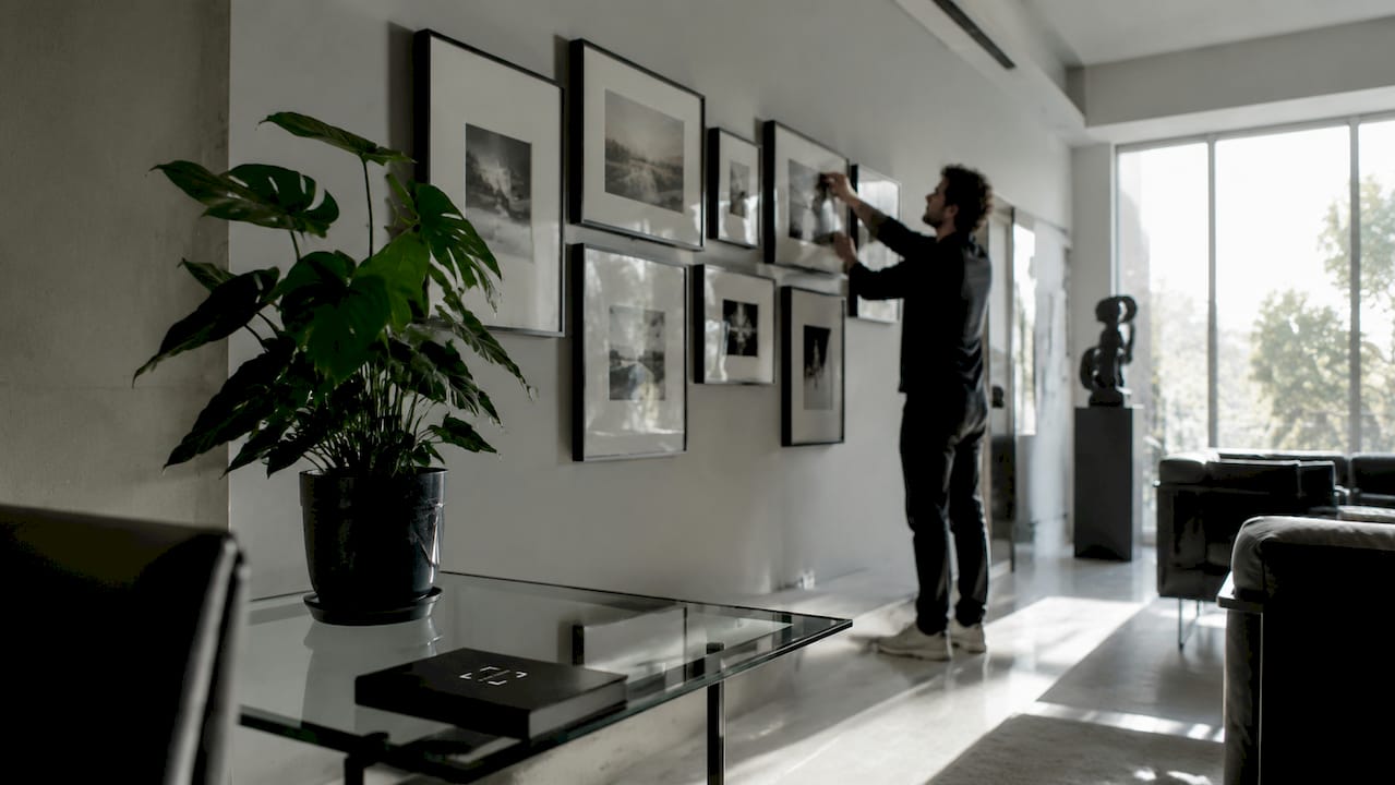
The cost advantage is real and significant. Gallery walls allow homeowners to incorporate inexpensive found objects, thrifted art, and personal mementos as a cost-effective alternative to large statement pieces. A $15 flea market print framed in black sits comfortably next to a $200 limited-edition photograph when the framing language is consistent.
The benefits of gallery walls also include emotional depth that a single piece rarely achieves. A collection of your grandmother’s postcards, a child’s crayon drawing, and a travel photograph from Portugal all carry weight together. Each item amplifies the others. That layered meaning is what makes guests stop and look, and what makes a house feel like a home.
Key advantages of gallery walls over single statement pieces:
- Affordability: You can mix price points freely without the display suffering.
- Storytelling: Multiple pieces create narrative arcs that one artwork cannot.
- Flexibility: You can swap, add, or remove pieces as your life evolves.
- Scale control: You can fill a large wall without committing to one oversized canvas.
- Personal expression: The collection itself becomes the art, not just any individual piece.
What design principles make a gallery wall feel intentional, not cluttered?
The line between a curated gallery wall and a cluttered mess comes down to three decisions: framing, spacing, and editing. Get these right, and even an eclectic mix of styles reads as deliberate and polished.
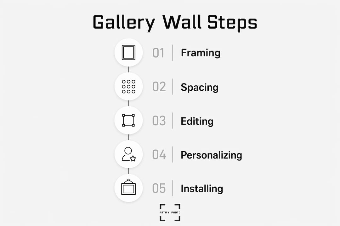
Framing consistency
Standardizing frame colors or consistent matting tones creates a common thread that prevents a gallery wall from feeling haphazard. You do not need identical frames. You need a shared visual language. A set of thin black frames in varying sizes reads as a collection. The same pieces in mismatched gold, white, and natural wood frames read as clutter. Consistent matting achieves the same effect with even more flexibility, since the mat color unifies pieces regardless of frame style.
Spacing discipline
Uniform spacing of 2–4 inches between frames produces a clean, cohesive visual flow. Gaps that are too wide make the arrangement feel scattered. Gaps that are too tight make it feel suffocating. Measure and mark before you hang anything.
The editing rule
The most luxurious gallery walls result from intentional editing. Removing pieces that do not fit the cohesive story elevates the display. This is the principle most homeowners skip. They add and add, never subtracting. A tighter collection always reads better than a full one.
Overcrowding is the most common mistake. About 12 well-chosen pieces often look better than 20 pieces used simply to fill space. That number is a useful benchmark, not a hard rule. The point is that restraint signals confidence.
Pro Tip: Before committing to any layout, learn to create cohesive art displays by identifying one anchor piece, typically the largest or most visually dominant, and building the arrangement outward from it.
| Design element | What to do | What to avoid |
|---|---|---|
| Frame color | Stick to one or two tones | Mixing more than three distinct finishes |
| Spacing | Keep gaps at 2–4 inches | Irregular gaps between frames |
| Piece count | Aim for 12 well-chosen works | Filling space with unrelated extras |
| Anchor piece | Use one large focal item | Starting with all similarly sized pieces |
| Editing | Remove anything off-theme | Keeping pieces out of sentimentality alone |
How can personal items deepen the emotional impact of a gallery wall?
Art prints and photographs are the obvious starting point, but the most memorable gallery walls go further. New design trends encourage incorporating personal items like handwritten notes, children’s drawings, and heirloom textiles to add emotional meaning and texture. This shift changes the gallery wall from a design feature into a personal archive.
Framing a piece of fabric, a vintage map, or a handwritten recipe introduces tactile variety that flat prints cannot provide. The eye moves differently across a wall that mixes textures. A shadow box holding a child’s first pair of shoes sits next to a watercolor print and suddenly the whole wall carries more weight.
“A gallery wall that holds only purchased art tells visitors what you like. A gallery wall that holds your grandmother’s handkerchief, your child’s first drawing, and a photograph from your wedding tells them who you are.”
Personal items worth considering for your gallery wall:
- Handwritten letters or notes framed under glass add warmth and intimacy.
- Children’s drawings give the wall a living quality that changes as the child grows.
- Heirloom textiles such as embroidered fabric or vintage scarves introduce color and texture.
- Travel mementos like pressed flowers, ticket stubs in shadow boxes, or hand-drawn maps ground the collection in real experience.
- Family photographs printed at varying sizes create visual rhythm and emotional anchors.
The key is that each personal item must earn its place visually. Frame it properly. Give it breathing room. Treat it with the same respect you would give a purchased print. When you do, the gallery wall becomes something no store-bought collection can replicate.
What are the best tips for planning and installing a gallery wall?
Planning on paper saves hours of patching holes in your wall. The installation process has a clear sequence, and skipping any step creates problems that are hard to fix later.
- Choose your wall and measure it. Note the width, height, and any obstacles like outlets or light switches.
- Select your pieces and lay them on the floor. Arrange them until the composition feels balanced. Photograph the layout before you move anything.
- Cut paper templates for each frame. Tape them to the wall at the intended position. This is the step most homeowners skip, and it is the most important one.
- Set your center height. Professional guidelines recommend centering the arrangement at 57–60 inches from the floor for optimal visual impact. This matches standard eye level and is the same height used in professional galleries.
- Check spacing with a ruler. Confirm 2–4 inch gaps between all templates before driving a single nail.
- Hang from the center outward. Start with your anchor piece, then work toward the edges.
- Step back and assess. View the wall from the room’s natural entry point, not from directly in front of it.
Visualization errors often arise when layouts are tried on the floor rather than the wall. Paper templates taped at the intended height prevent this pitfall. The floor flattens perspective. The wall shows you exactly what the finished display will feel like.
Pro Tip: Allow your gallery wall to evolve over time. Leave intentional gaps in the layout when you first install it. Those gaps invite new pieces and signal that the collection is alive, not finished.
| Installation step | Key detail |
|---|---|
| Paper templates | Cut to exact frame size; tape at final wall position |
| Center height | 57–60 inches from floor to arrangement center |
| Spacing check | 2–4 inches between all frames |
| Anchor piece first | Hang largest piece before surrounding works |
| Final assessment | View from room entry, not up close |
Key Takeaways
Gallery walls succeed when intentional editing, consistent framing, and personal objects work together to create a display that is both visually cohesive and emotionally specific to the homeowner.
| Point | Details |
|---|---|
| Editing over adding | About 12 well-chosen pieces outperform 20 randomly selected ones. |
| Framing consistency | Uniform frame color or matting unifies even an eclectic collection. |
| Correct height | Center your arrangement at 57–60 inches from the floor for gallery-standard impact. |
| Personal items | Heirlooms, handwritten notes, and children’s drawings deepen emotional resonance beyond purchased art. |
| Templates first | Tape paper cutouts to the wall before hanging to prevent spacing errors and wasted holes. |
What living with a gallery wall actually teaches you
The most honest thing I can say about gallery walls is this: the first version is almost never the best version. At Artify, we see homeowners treat their initial installation as permanent, then feel vague dissatisfaction they cannot name. The wall looks fine. It just does not feel right. The reason is almost always that they stopped editing too soon.
A gallery wall is not a project you finish. It is a practice you maintain. The best collections evolve as curators collect new pieces that tell their changing story. That means being willing to take something down, even a piece you love, when it no longer fits the story the wall is telling. That willingness to edit is what separates a gallery wall that feels alive from one that feels like a snapshot of a moment that has passed.
The other thing living with a gallery wall teaches you is that cohesion does not mean sameness. Intentional mismatching within a controlled palette creates visual interest that a perfectly matched set never achieves. The tension between a bold abstract print and a delicate pencil sketch, held together by identical black frames, is what makes the eye keep moving. That is the goal. Not a wall that looks designed. A wall that looks lived in, on purpose.
— Artify
Artify’s curated collections make starting easier
Building a gallery wall from scratch takes time, especially when you are sourcing individual pieces and hoping they will work together. Artify’s pre-made collections solve that problem directly. Each collection is professionally curated to work as a group, with consistent visual language, complementary scales, and framing options that remove the guesswork from cohesion.
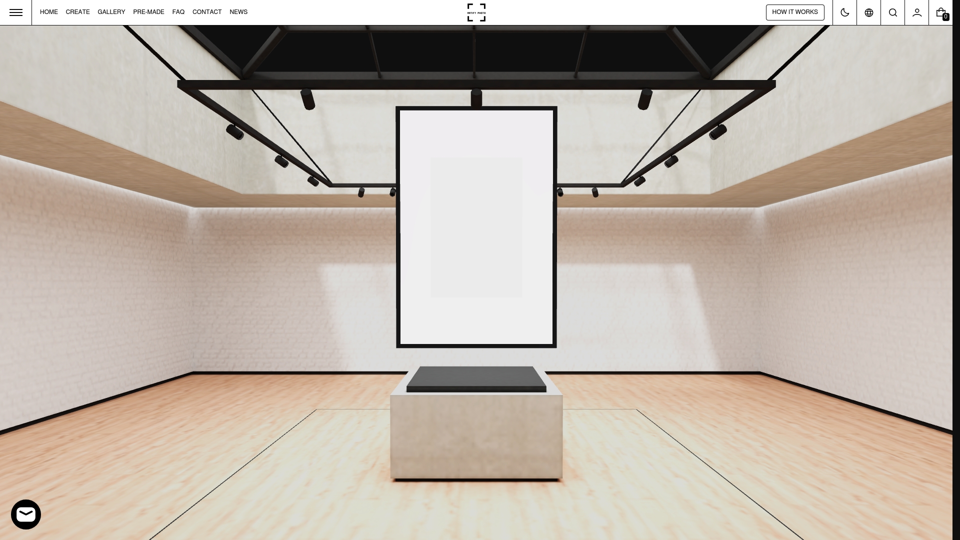
You can use a pre-made collection as the foundation of your gallery wall, then add personal photographs and mementos around it over time. That approach gives you a polished starting point without locking you into a static display. Artify also offers a 3D room preview so you can see how a collection sits on your specific wall before you order. The result is a gallery wall that feels personal from day one and grows more so with every piece you add.
FAQ
What is a gallery wall?
A gallery wall is a curated arrangement of artwork, photographs, and personal objects displayed together on a single wall to create a cohesive visual story.
How many pieces should a gallery wall have?
About 12 well-chosen pieces typically produce a stronger result than 20 pieces used to fill space, according to professional installation guidelines.
What height should a gallery wall be centered at?
Professional guidelines recommend centering the arrangement at 57–60 inches from the floor, which aligns with standard eye level and matches gallery installation standards.
How do I keep a gallery wall from looking cluttered?
Maintain uniform spacing of 2–4 inches between frames, standardize frame colors or matting, and edit out any piece that does not fit the collection’s visual story.
Can I mix personal items with purchased art on a gallery wall?
Yes. Framed handwritten notes, children’s drawings, heirloom textiles, and travel mementos add emotional depth and texture that purchased art alone cannot provide.